In the Introduction
to colorist vignette we offered an overview of colorist
functionality and several examples of how functions can be combined to
map distributions. Here, we explore in more detail how metrics of
spatiotemporal distributions (i.e., layer, intensity, and specificity
information) are visualized using color attributes (i.e., hue, opacity,
and chroma, respectively), and how users can modify visualizations to
emphasize different narrative goals.
As a quick reminder, users provide colorist with a
Rasterstack containing multiple layers of distributions.
Layers may describe a temporal sequence of distributions for a single
species or individual, or they may describe distributions of multiple
species or individuals within a single time period. The functions in
colorist were designed to visualize where, when, and how
consistently species or individuals occur throughout a landscape but may
be useful for visualizing multivariate data in a variety of other
contexts.
In a typical workflow, users calculate metrics to describe their
distributions and then choose a palette to enable visualization of those
metrics. The palette and metrics are combined and visualized using a map
function and a legend is generated to aid interpretation. The appearance
of visualizations can be tuned by modifying the default settings of
colorist functions at different points in the workflow.
1. Change how layers are represented by hues
The first type of adjustment we explore involves changing the assignment of hues to raster layers in palette functions.
Three palette functions are available in colorist, each
created with a different visualization problem in mind. The
palette_timecycle() function allows users to visualize
cyclical sequences of distributions, palette_timeline() is
geared toward linear sequences of distributions, and
palette_set() is appropriate for unordered sets of
distributions.
To ensure that viewers can make “fair“ visual comparisons of
distributions through space and time, colorist functions
impose rather strict constraints on how palette hues are assigned to
layers, and how they are deployed in subsequent maps. There are
opportunities for users to modify default settings, however, so that
hues facilitate specific communication goals.
Below, we provide two hypothetical mapping problems that can be addressed by changing how hues are assigned to raster layers. We start by loading the necessary libraries.
Map monthly distributions of a species in the southern hemisphere
The sample Field Sparrow data included with colorist
describe monthly occurrence probabilities for a partially migratory bird
in the eastern United States. We can explore the data visually by
calculating distribution metrics with metrics_pull(),
adopting the default HCL-based color palette provided by
palette_timecycle(), and mapping each of the data layers
using the map_multiples() function.
# pull metrics, generate default palette, map layers
m1 <- metrics_pull(fiespa_occ)
p1 <- palette_timecycle(12)
map_multiples(m1, p1, labels = names(fiespa_occ), ncol = 4)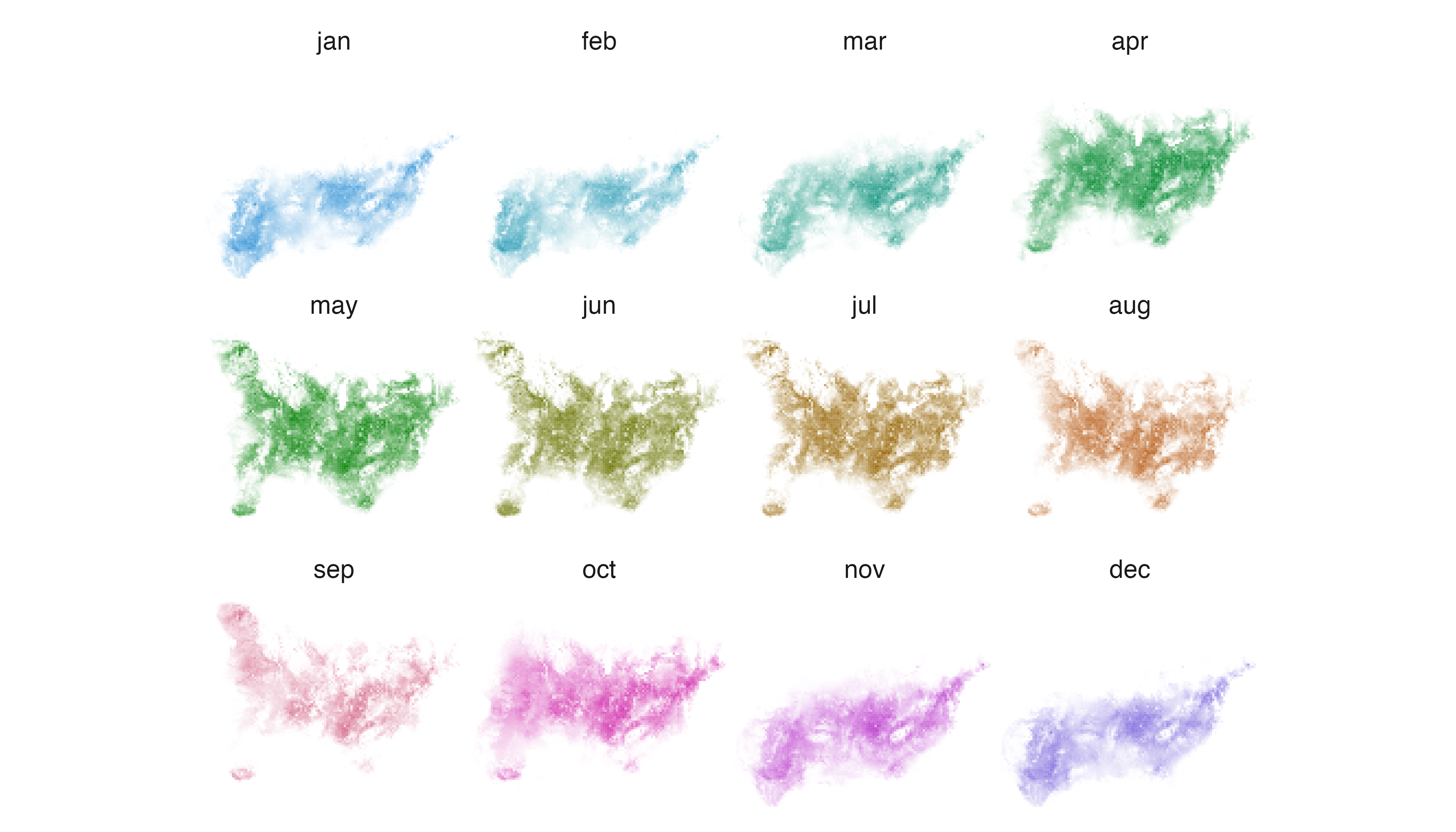
The default settings for palette_timecycle() produce a
palette of hues that begins at “blue” in January and moves progressively
toward “green”, “yellow”, and “red”, before returning toward “blue”.
These hues align with our general sense of seasonal progression in
northern temperate regions, where we move from “winter” toward “spring”,
“summer”, “fall”, and back to “winter”.
Now, let us assume that our bird species actually occurs in temperate
regions of the southern hemisphere. The timing of seasonal progression
is offset by approximately six months from northern temperate regions.
Clearly, the default settings in palette_timecycle() are no
longer appropriate because the hues indicating particular seasons are
not aligned with the correct months.
To realign seasonal hues and months for a southern temperate species,
we need to modify the start_hue argument in
palette_timecycle(). So, we specify a value of 60 rather
than accept the default value of 240. This change tells
palette_timecycle() to begin assigning hues to layers on
the opposite side of the color wheel, 180 degrees, and six months away,
from the default setting.
# change palette start position on color wheel
p1_custom <- palette_timecycle(12, start_hue = 60)

# map layers
map_multiples(m1, p1_custom, labels = names(fiespa_occ), ncol = 4)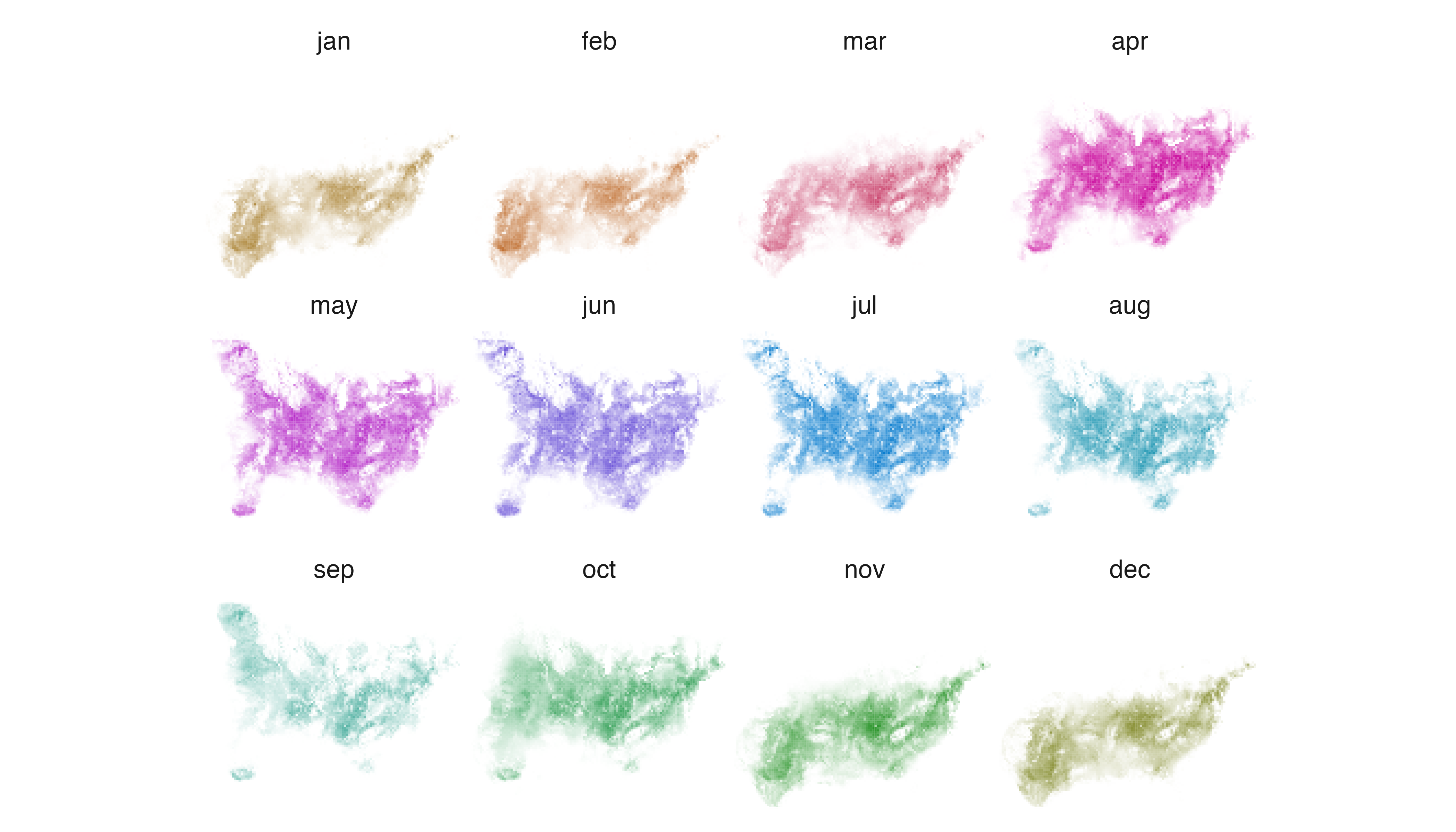
Now, the progression from “blue“ winter, to “green“ spring, to “yellow“ summer, and “red“ fall seasons begins in July rather than January and hues in the resulting maps more closely indicate the seasons experienced by our hypothetical southern temperate bird species.
Map space use by individual animals using relevant hues
When a Rasterstack contains distributions of multiple
species or individuals, it is easy to imagine that users may want to
override the default assignment of hues in order to reinforce some
aspect of their identity.
Here, we turn to data describing utilization distributions for two
African Elephants in Etosha National Park from 2011, individuals LA11
and LA14. Let us assume that they are better known as “Purple
People-eater“ and “Jolly Green Giant“. We begin by calculating
distribution metrics with metrics_pull() and then generate
a palette using the default settings for palette_set().
When we combine our metrics and palette using
map_multiples(), the two utilization distributions generate
significant cognitive dissonance.
# pull metrics, generate default palette, map layers
m2 <- metrics_pull(elephant_ud)
p2 <- palette_set(2)
map_multiples(m2, p2, labels = c("'Purple People-eater'", "'Jolly Green Giant'"), ncol = 2)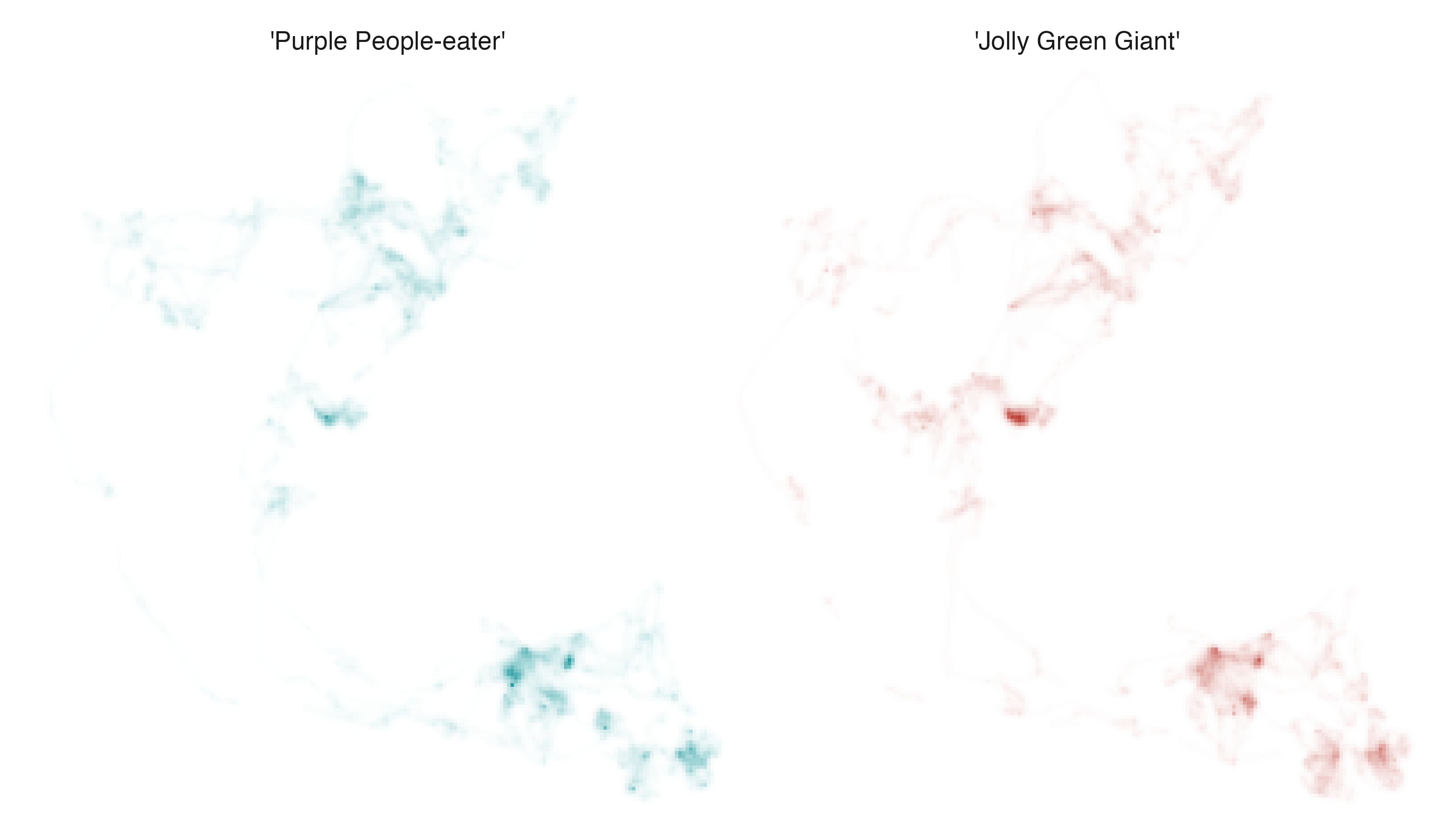
To communicate a consistent signal of identity across the labels and
the maps, we need to override the default hue settings in
palette_set(). We can achieve this by providing the
custom_hues argument with a vector of integers indicating
where on a rainbow color wheel the function should sample hues. “Purple”
hues are found near 280 and “greens” are found near 120, so we specify
those values in the appropriate order and visualize our adjustments.
# use custom_hues argument to make specific hue choices
p2_custom <- palette_set(2, custom_hues = c(280, 120))

# map layers
map_multiples(m2, p2_custom, labels = c("'Purple People-eater'", "'Jolly Green Giant'"), ncol = 2)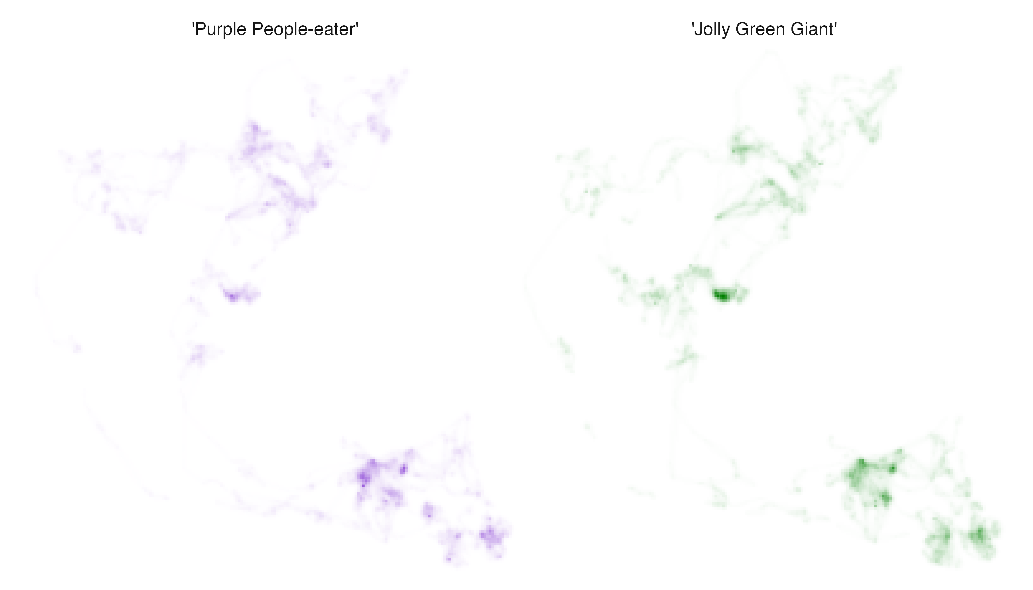
The result: cognitive harmony.
2. Change the relationship between intensity and opacity
The second type of adjustment we explore involves changing the
relationship between intensity and opacity values, a modification that
can be made in the map_single() and
map_multiples() functions.
There are a variety of contexts in which it is difficult to visualize important information about populations or individuals because intensity values (i.e., relative abundance, occurrence, or probability density values) have unusual distributions. For example, it can be difficult to indicate the extent to which a species or individual uses an entire landscape when changing availability of resources or inconsistent social interaction causes an extremely skewed distribution of intensity values. Conversely, it can be a challenge to indicate areas of particular importance to species or individuals when they appear at first glance to use an entire landscape relatively evenly.
Cartographers have developed an array of strategies for modifying how
data values are represented in maps, many of which involve binning or
transforming data. While there is no right “answer” to the “problem” of
visualizing data with an unusual distribution, colorist
functions focus on transforming data using a slightly modified
scales::modulus() transformation. This decision stems from
one of our original goals for the colorist package: to
visualize continuous variation in intensity values through space and
time without truncating or binning values.
In colorist, the relationship between intensity and
opacity values is controlled with a lambda_i argument in
the map_multiples() and map_single()
functions. The default setting of lambda_i = 0 prescribes a
linear relationship between intensity and opacity values. Specifying
negative values for lambda_i increases the opacity and
apparent intensity of cells with moderate intensity values, giving them
greater visual weight. Specifying positive values for
lambda_i reduces the opacity and apparent intensity of
cells with moderate intensity values, thus highlighting cells with high
intensity values.

Cell opacity as a function of intensity values and
lambda_i.
Below, we provide two examples of how users may modify the
lambda_i argument to meet different narrative goals.
Emphasize the extent of the landscape used by an individual animal
If we continue our exploration of African Elephant data and inspect
the utilization distribution for “Jolly Green Giant“ using the
map_single() function, it is clear that the individual uses
some areas of the landscape much more intensively than others.
# map one layer
map_single(m2, p2_custom, layer = 2)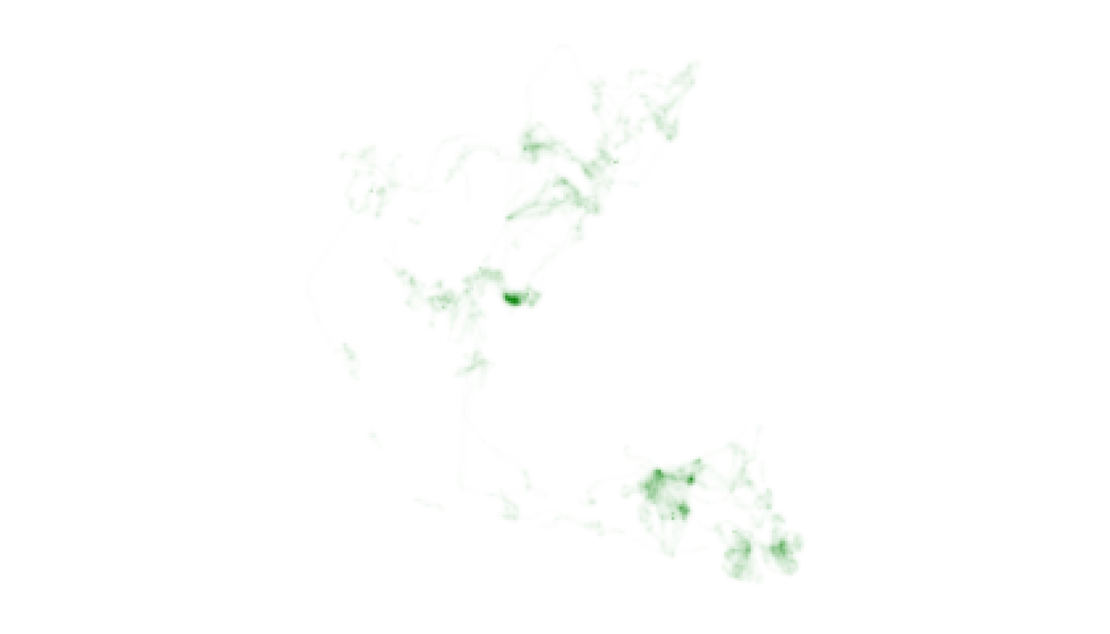
The map does not effectively visualize the system of trails used to
move between areas of intensive use, however, which may be of specific
management interest. In order to visually emphasize the full extent of
the landscape used by “Jolly Green Giant”, we need to provide the
lambda_i argument in map_single() with a
negative number rather than accept the default value of 0. This change
should increase the visual weight of cells containing moderate and low
intensity values.
# map one layer with adjustment to lambda_i
map_single(m2, p2_custom, layer = 2, lambda_i = -12)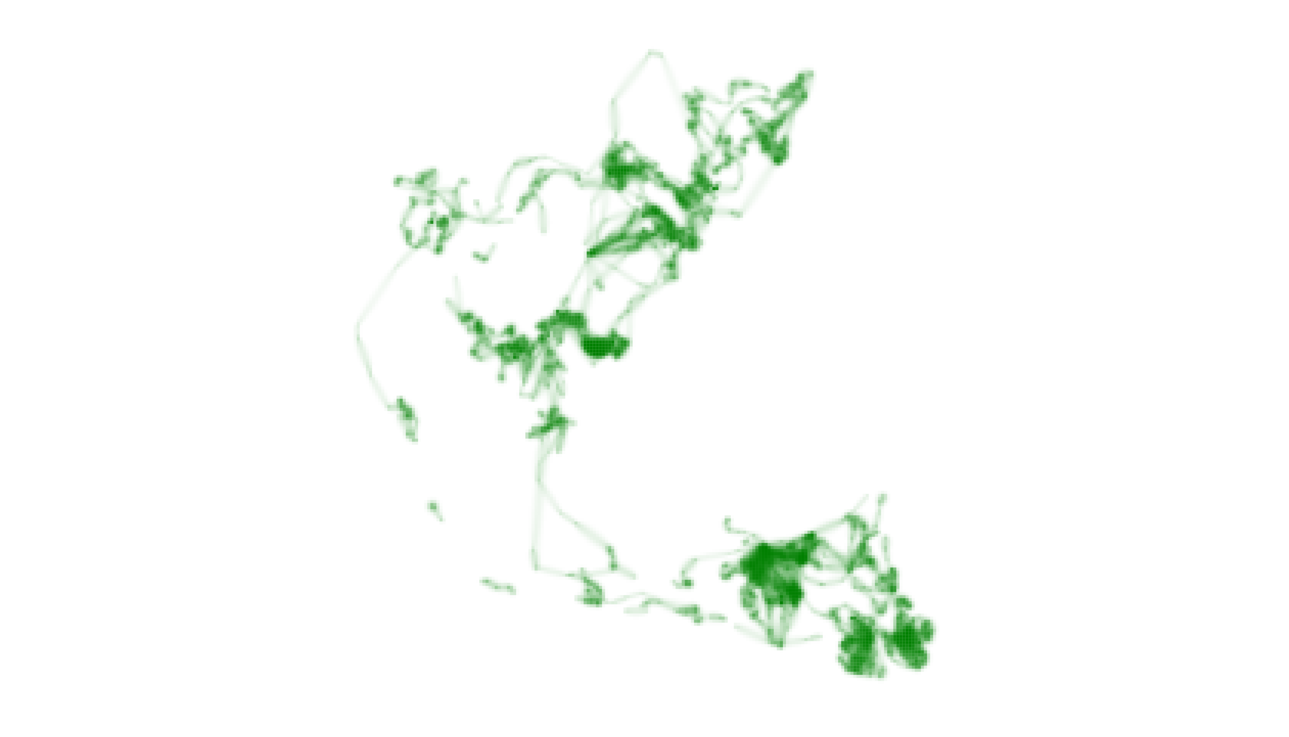
After adjusting lambda_i, our map more clearly indicates
the full extent of “Jolly Green Giant’s” movements throughout the year,
albeit at a cost of distinguishing subtle differences in intensity of
use between cells. It is important for users to recognize this trade-off
and to make thoughtful decisions about how best to communicate their
narrative goals while respecting the information embedded in their
data.
Emphasize specific locations that are essential to an individual animal
Next, let us explore utilization distribution data for an individual
Fisher that describes its use of the landscape over nine sequential
nights in upstate New York. First, we use metrics_pull() to
calculate distribution metrics. Then, we use
palette_timeline() to generate a palette. Finally, we make
a map using the map_multiples() function.
# pull metrics, generate default palette, map layers
m3 <- metrics_pull(fisher_ud)
p3 <- palette_timeline(fisher_ud)
map_multiples(m3, p3, labels = names(fisher_ud))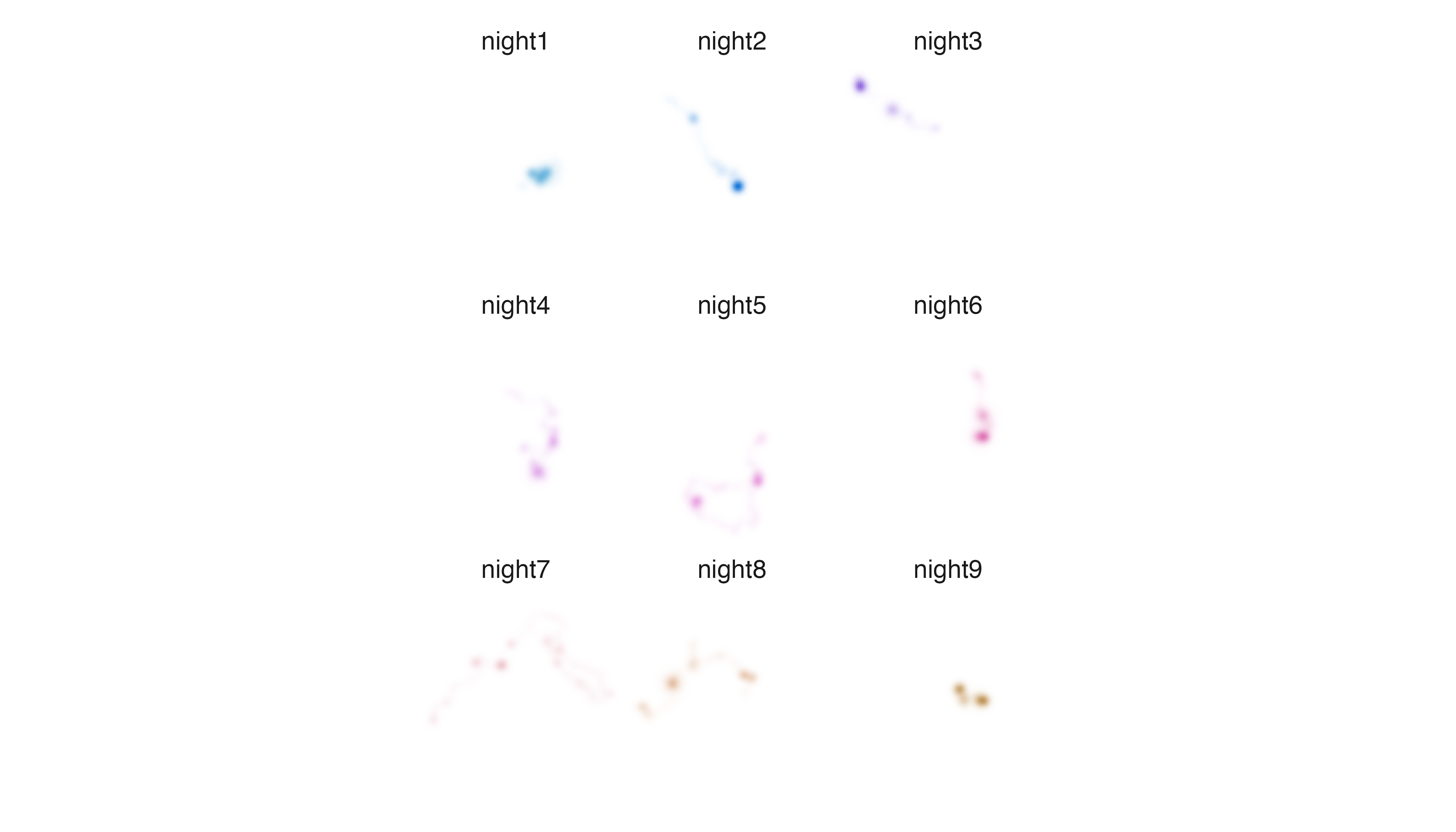
It is clear that the Fisher is using different parts of its territory
to different degrees within and among nights, but if we want to more
clearly understand and illustrate which areas were used most intensively
we need to change the relationship between intensity and opacity values.
In order to highlight intensively used cells, we provide the
lambda_i argument in map_multiples() with a
positive number rather than accept the default value of 0.
# map layers with adjustment to lambda_i
map_multiples(m3, p3, labels = names(fisher_ud), lambda_i = 12)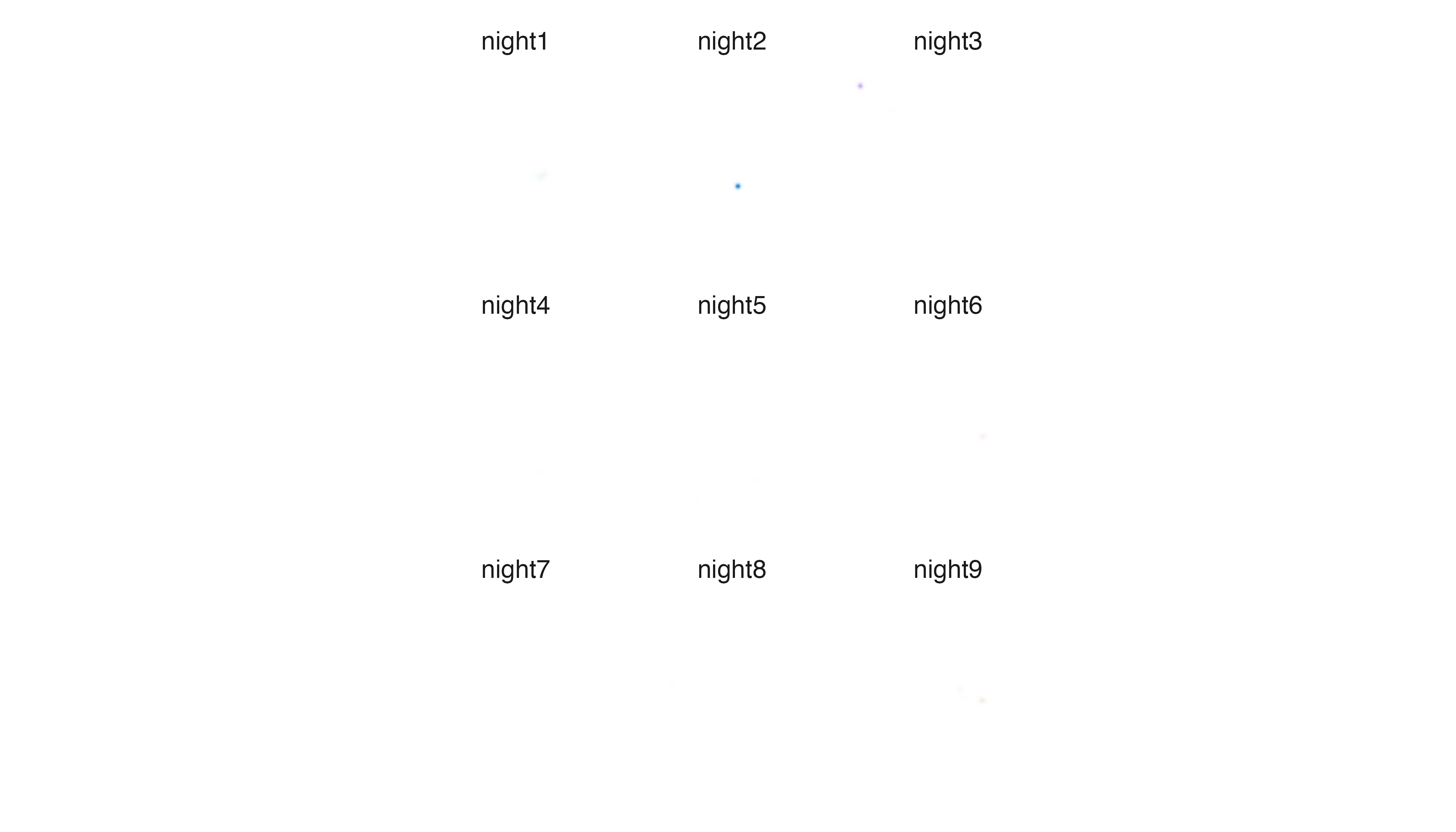
At first glance, it may appear that we have made a mistake of some
kind. Nearly all of the data seems to have disappeared. This is because
our (extreme) adjustment to lambda_i has decreased the
opacity and apparent intensity of cells containing intermediate and low
intensity values and preserved opacity values only in the cells that
were used very intensively. It makes for a very sparse series of maps,
but we can now clearly see that two locations were used very intensively
by the Fisher, one on the second night of the study period and one on
the third night.
3. Change the relationship between specificity and chroma
The third type of adjustment we explore involves changing the
relationship between specificity and chroma values, a modification that
can be made in the map_single() function. In mechanical
terms, the transformation is nearly identical to the one used for
changing the relationship between intensity and opacity values. The
visual and narrative impacts are quite different, however.
Remember that specificity values indicate the degree to which intensity values are unevenly distributed across raster layers and that variation in specificity values is indicated by varying the chroma of cell colors. Low specificity values indicate intensity values are similar in all layers of a cell, are linked to low chroma values, and appear “gray”. High specificity values indicate intensity values are concentrated in a single layer, are linked to high chroma values, and appear as “bright” colors.
Depending on the nature of the data contained in a
Rasterstack, specificity values can take on a variety of
meanings, including, seasonal use of a cell, ephemeral use of a cell, or
differential use of a cell by multiple species or individuals. Changing
the relationship between specificity and chroma values can have
important consequences for how viewers interpret patterns of
spatiotemporal overlap among raster layers.
The relationship between specificity and chroma values is controlled
with a lambda_s argument in the map_single()
function. Again, the default setting of 0 prescribes a linear
relationship between specificity and chroma values, analogous to the
default relationship between intensity and opacity. Specifying negative
values for lambda_s increases the chroma and apparent
specificity values in cells with moderate specificity values, making
them more “colorful“. Specifying positive values for
lambda_s reduces the chroma and apparent specificity values
of cells with moderate specificity values, making them more “gray“.
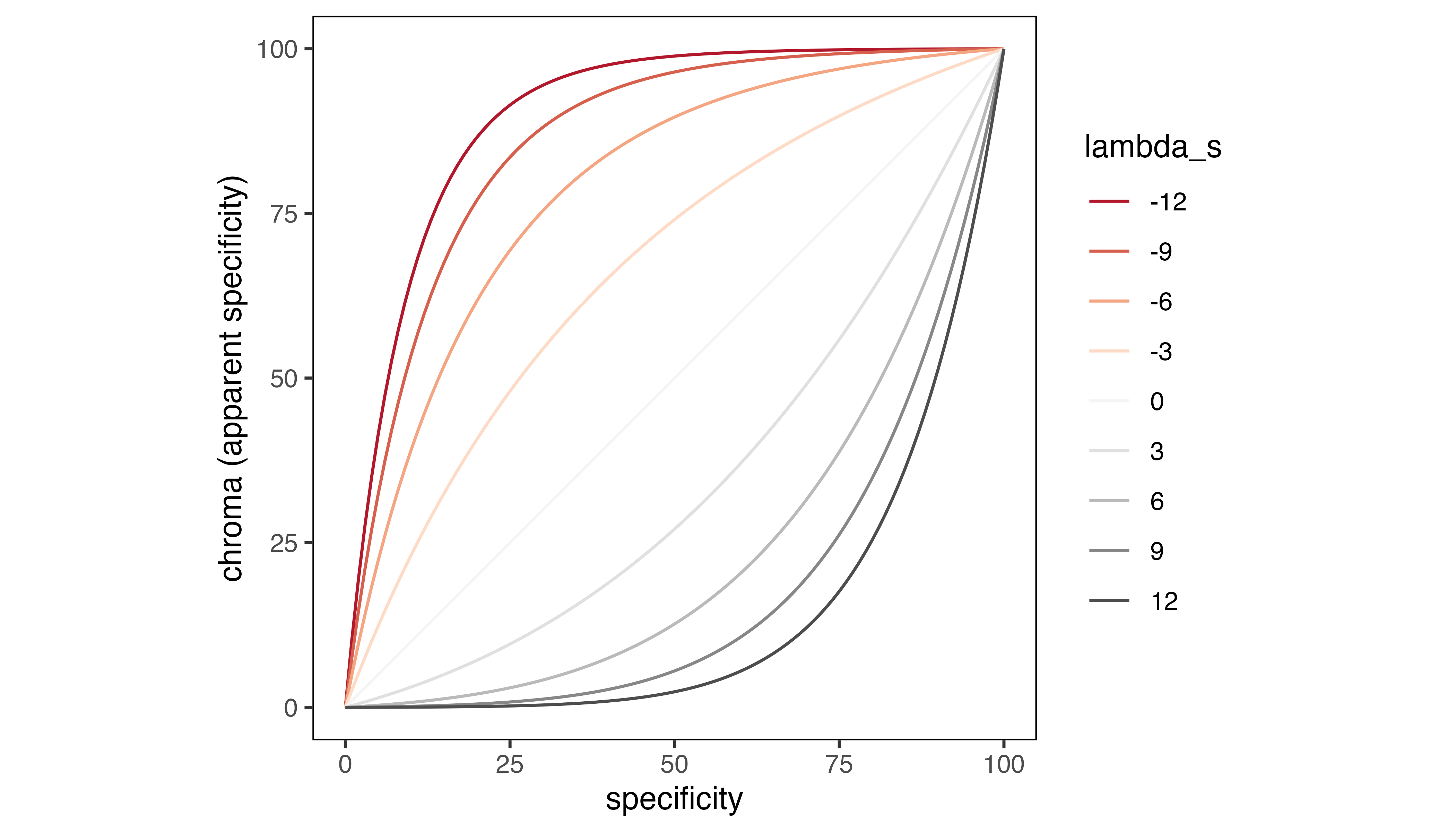
Cell chroma as a function of specificity values and
lambda_s.
Below, we provide two examples of how users may modify the
lambda_s argument to address different narrative goals.
Emphasize differences in how consistently locations are used by an individual animal
Using the sample Fisher data which contain utilization distributions
for nine sequential nights, we can visualize patterns of spatiotemporal
overlap by calculating distribution metrics using
metrics_distill(), creating a palette using
palette_timeline(), and generating a map with
map_single(). To make rarely used areas more conspicuous we
also set lambda_i = -5 in map_single() and
then we create a legend to aid interpretation of our map using
legend_timeline().
# distill metrics, visualize metrics in a single map, create legend
m3_distill <- metrics_distill(fisher_ud)
map_single(m3_distill, p3, lambda_i = -5)
legend_timeline(p3, time_labels = c("April 7", "April 15"))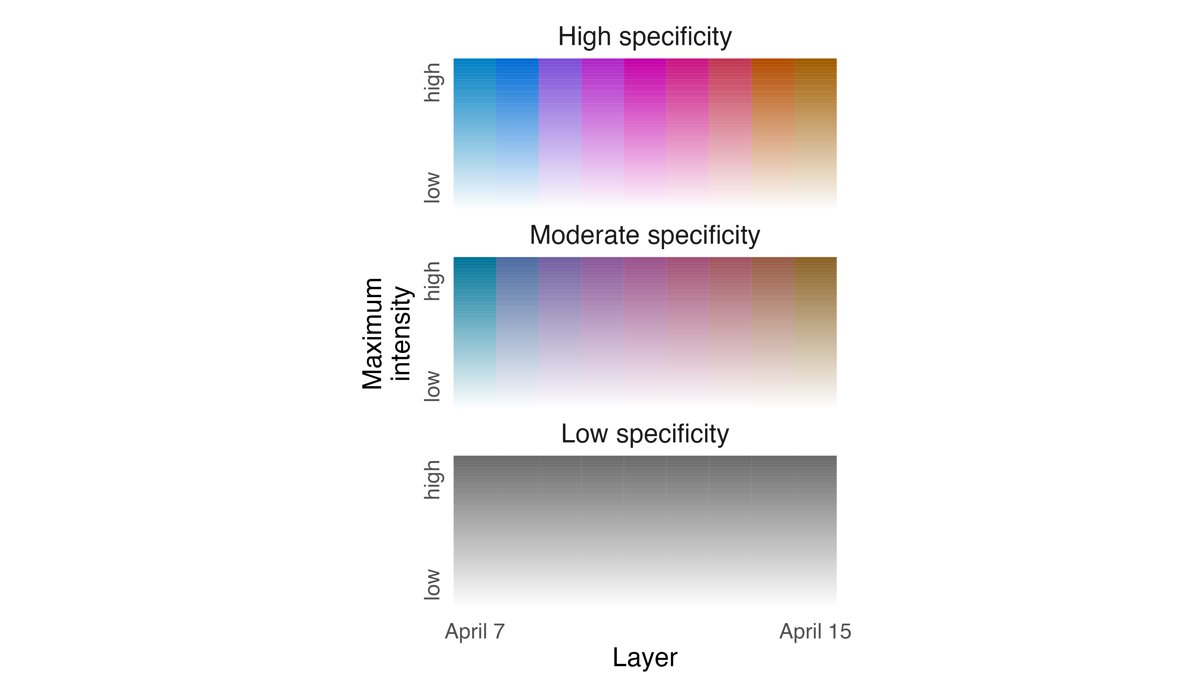
The abundance of brightly colored cells indicates that the Fisher
used different parts of its territory almost every night, and the
different hues indicate which night each cell was used most intensively.
If we want to more clearly indicate which parts of the Fisher territory
were used repeatedly, we need to adjust how specificity values are
represented using the lambda_s argument in
map_single(). To emphasize patterns of consistent use
across nights we need to specify a positive number for
lambda_s, an adjustment that decreases chroma and apparent
specificity values in cells that contain moderate specificity values,
making them appear more “gray“.
# visualize metrics in a single map with adjustment to lambda_s
map_single(m3_distill, p3, lambda_i = -5, lambda_s = 12)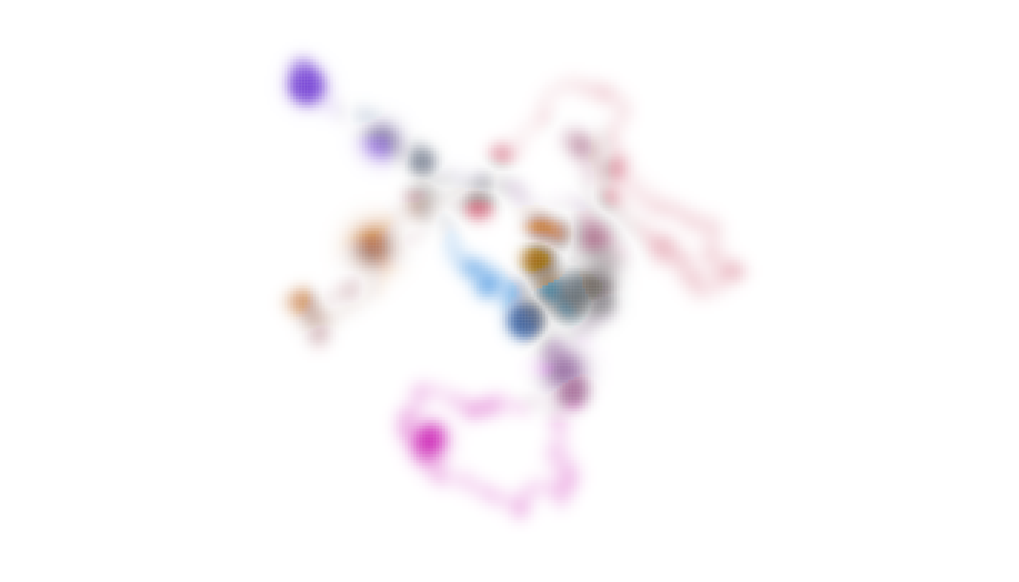
The revised map and the original map have very similar perceptual
weights but, overall, the new map is less “colorful” as a result of
supplying lambda_s with a positive number. By changing the
relationship between specificity and chroma values, we now have a map
that more clearly indicates which areas were used repeatedly by the
Fisher across nights.
Emphasize timing of peak occurrence for a seasonal migrant
There are other situations in which researchers may want to emphasize when a species is most likely to be found in a particular place rather than emphasizing how consistently it is likely to be found in a particular place. For example, in the case of migratory birds, a researcher may want to communicate to birders the specific time of year they are most likely to find a given species in their backyard. We can address this challenge using our Field Sparrow data.
As with the Fisher, we start by calculating distribution metrics with
metrics_distill() and then we generate a map by feeding
metrics and the palette we created in the first example to the
map_single() function. We also create a legend based on
that palette using legend_timecycle() which helps us find
Field Sparrows in space and time.
# distill metrics, visualize metrics in a single map, create legend
m1_distill <- metrics_distill(fiespa_occ)
map_single(m1_distill, p1)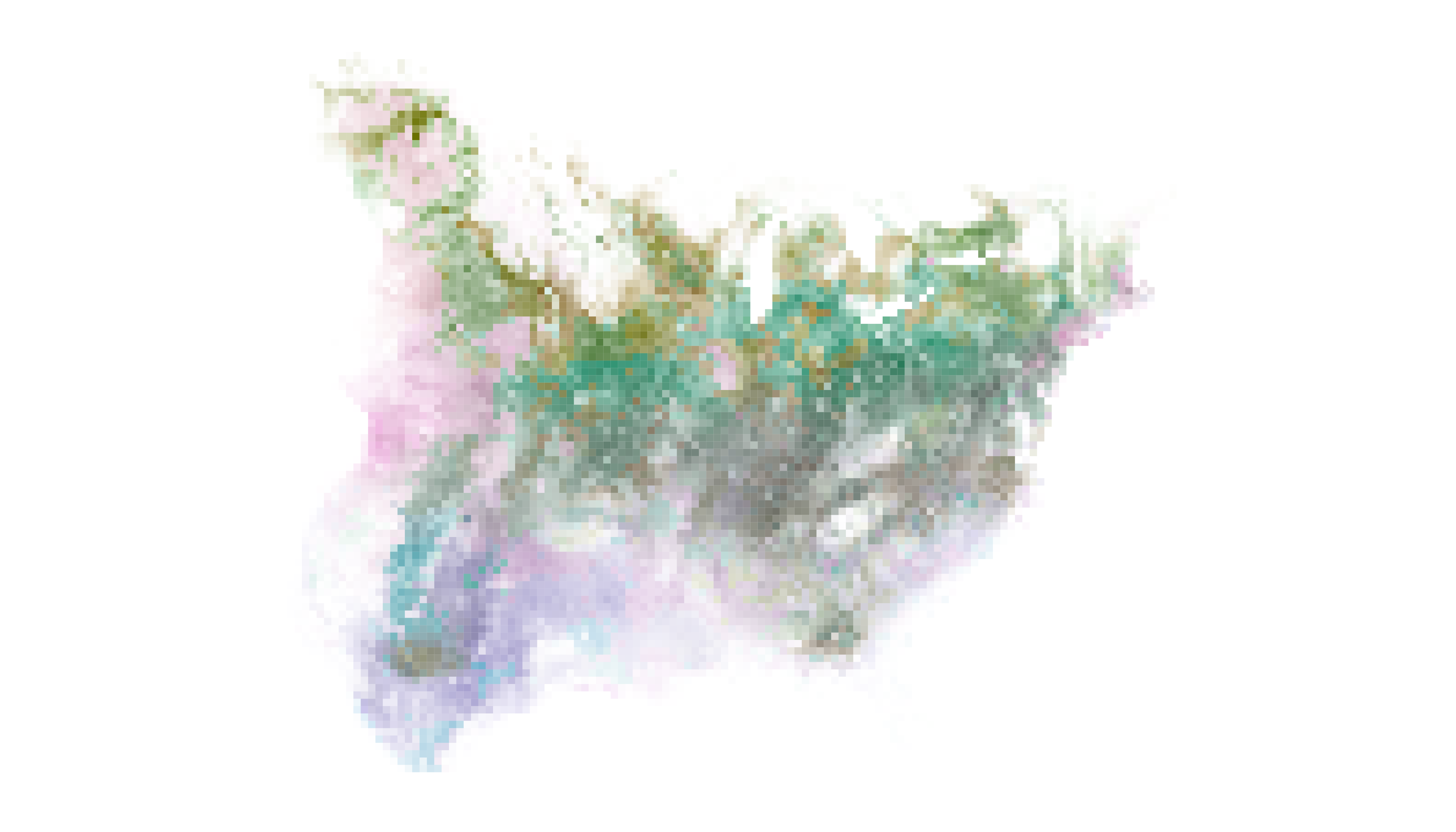
legend_timecycle(p1, origin_label = "Jan 1")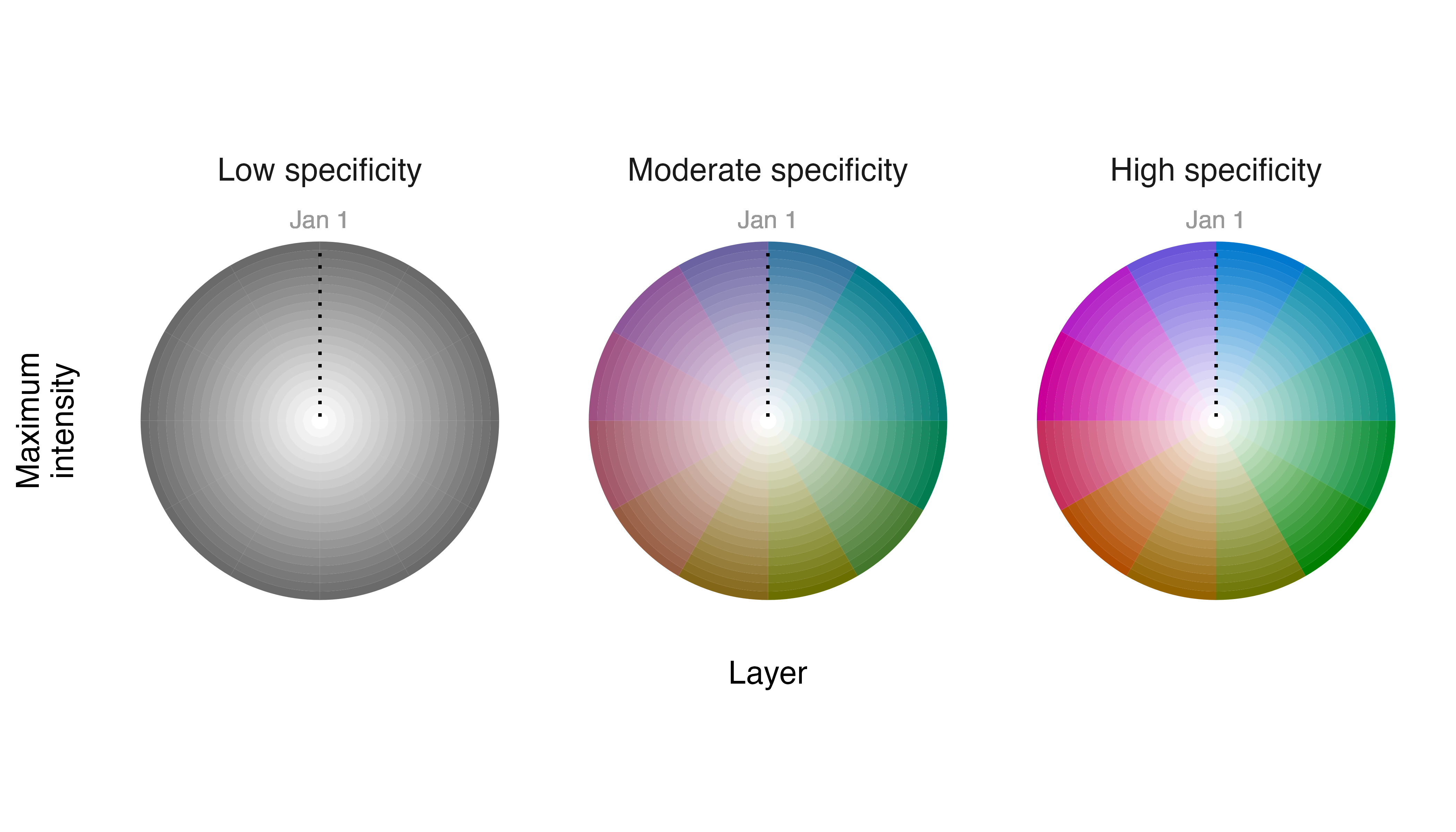
Cells where populations of Field Sparrows persist at approximately the same level throughout the year have low specificity values and low chroma values and appear “gray“ in our map. Cells where populations occur only seasonally have high specificity values and high chroma values and appear “colorful“ with the hue in a cell indicating the month of peak occurrence.
If we want to emphasize information about when a species is most
likely to be found (i.e., timing of peak occurrence) we can adjust the
relationship between specificity and chroma values. We inflate the
chroma and apparent specificity values for cells that contain moderate
and low specificity values by providing the lambda_s
argument with a negative number.
# visualize metrics in a single map with adjustment to lambda_s
map_single(m1_distill, p1, lambda_s = -12)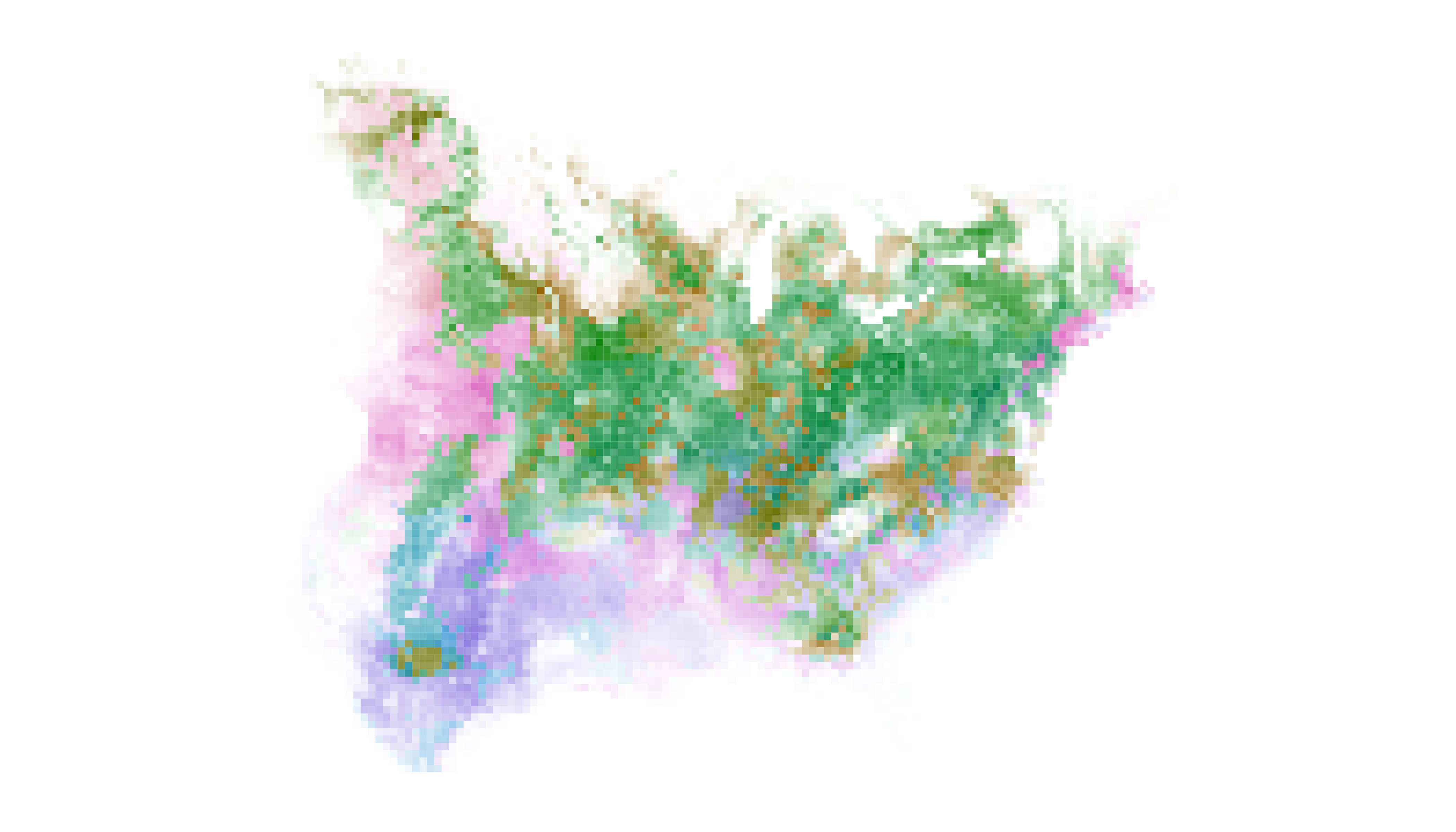
The revised distribution map has approximately the same visual weight
as the original, but our adjustment to lambda_s has made
“gray” cells much more “colorful”. Now, information about timing of
maximum occurrence is readily available to viewers and they should be
able to identify in which month Field Sparrows are most likely to occur
in their backyard and at what intensity.
Again, it is important for users to recognize that adjustments to
lambda_s require a sacrifice of information about
specificity. In the revised map, it is much more difficult for viewers
to reliably assess how consistently Field Sparrows occur in a given cell
throughout the year.