Maps play a central role in research aimed at understanding how and why wildlife distributions shift through space and time. They give form to complex sets of assumptions, hypotheses, and predictions and, in doing so, offer the promise of embodying detailed knowledge about species and individuals. Traditionally, biologists have used range maps, and home range maps, to describe animal distributions in space and time. Despite their historical success as representational forms, they are increasingly incapable of communicating our knowledge of wildlife distributions.
Technologies for acquiring and modeling wildlife distribution data have improved dramatically in recent years. As a result, we possess ever more detailed descriptions of animal occurrence, abundance, and density in space and time. This glut of high-resolution spatiotemporal information comes with its own set of visualization challenges, however. Intuitively, we might try to reveal patterns of spatiotemporal stasis and change by stacking distributions on top of each other, but this strategy often results in underlying data being occluded or muddied, depending on whether and how layers are combined.
We developed the colorist package to provide researchers
with a variety of options for exploring and communicating information
about wildlife distributions in space and time. colorist
emphasizes the use of color to indicate where, when, and how
consistently species, individuals, or groups of animals can be found. In
order to do this effectively, colorist takes information from a stack of
rasters, processes it, and links it to HCL (hue-chroma-luminance) color
palettes in specific ways so that occurrence, abundance, or density
values have nearly equal perceptual weights in resulting maps.
Usage
Like other visualization tools, we suggest that the
colorist package may be useful to researchers in different
ways throughout the process of building knowledge. Researchers may want
to use colorist to explore preliminary data through
visualizations, with the goal of developing or refining research
questions. Alternatively, researchers may come to colorist
having already discovered something interesting about wildlife
distributions that they would like to communicate in visualizations.
Regardless of where researchers are in the process of discovery, it is
important to remember that colorist functions were built to
handle and display data. People are still in charge of their
interpretation.
The colorist package works on raster data stored as
RasterStack objects. Individual raster layers might
represent an ordered temporal sequence of species distributions or
utilization distributions. Alternatively, raster layers might represent
an unordered set of distributions for multiple species, or individuals,
within a single time period. Whatever temporal or identity relationships
exist within the stack, all raster layers should contain values in the
same units (e.g., abundance, occurrence, or probability density) to
ensure that they can be meaningfully compared.
When preparing raster layers, users should be sure to distinguish
raster cells with 0 values (e.g., cells in which a species is predicted
to occur with probability 0) from cells with NA values (e.g., cells for
which occurrence predictions could not be made). This distinction is
important for identifying areas where knowledge of distributions is
incomplete. In addition, because colorist functions can take time to
process large RasterStack objects, researchers may want to
aggregate their raster data spatially and/or temporally while exploring
alternative visualization strategies.
The basic workflow for colorist is as follows:
- Metrics: Users calculate metrics to describe their distributions.
- Color palette: Users choose a color palette to enable visualization of metrics.
- Map: Users combine metrics and a palette to map distributions in a series of small multiples or in a single map.
- Legend: Users generate a legend to accompany their map.
Examples
Here, we describe three use cases to illustrate colorist
functions and how they can be combined to map distributions.
1. Map a species distribution across the annual cycle
There is growing interest in characterizing wildlife distributions across the full-annual cycle, as opposed to one or two seasons, so that we can better understand the places and times at which populations are vulnerable. Maps play an important role in that process. In the past, range maps for resident species typically contained a single block of color along with political boundaries that indicated where a species can be found throughout the year. In contrast, range maps for migratory species typically contained several blocks of color indicating where a species might be found during a particular season, or throughout the entire year.
Here, we use aggregated eBird Status and Trends data for Field Sparrow (Spizella pusilla) to illustrate a different strategy for creating annual cycle maps, one that leverages continuous occurrence data (rather than categorical presence-absence data) to describe where and when viewers might be able to find a species. Field Sparrow is a relatively small bird that is commonly found in open habitats throughout eastern North America. It is often considered a partial migrant in that some populations move throughout the year, while others are stationary. This results in heterogeneity in when, where, and how consistently birds can be found in space-time.
We start by loading the fiespa_occ data set. It contains
twelve raster layers, one for each month of the year. Cell values in
each layer indicate the modeled probability of Field Sparrow occurrence.
Additional Status and Trends data can be accessed using the ebirdst R
package.
library(sf)
library(ggplot2)
library(colorist)

# load data
data("fiespa_occ")
fiespa_occ
#> class      : RasterStack
#> dimensions : 100, 121, 12100, 12  (nrow, ncol, ncell, nlayers)
#> resolution : 26665.26, 26665.28  (x, y)
#> extent     : -1782551, 1443945, -1160698, 1505830  (xmin, xmax, ymin, ymax)
#> crs        : +proj=laea +lat_0=37.602 +lon_0=-86.264 +x_0=0 +y_0=0 +datum=WGS84 +units=m +no_defs
#> names      :       jan,       feb,       mar,       apr,       may,       jun,       jul,       aug,       sep,       oct,       nov,       dec
#> min values :         0,         0,         0,         0,         0,         0,         0,         0,         0,         0,         0,         0
#> max values : 0.5640106, 0.6057996, 0.6536915, 0.7482038, 0.7165731, 0.7626083, 0.7465307, 0.6465662, 0.5210227, 0.5762388, 0.6329718, 0.5829163
After confirming the data have been loaded correctly, we use
metrics_pull() to transform occurrence values from the
stack into intensity values that range from 0 (i.e., cells without Field
Sparrows) to 1 (i.e., the cell[s] with the highest occurrence value
anywhere in the stack). This process of “pulling” metrics from the
RasterStack preserves all of the information in the
original stack while preparing layers for subsequent visualization.
# pull information from the stack
m1 <- metrics_pull(fiespa_occ)
m1
#> class      : RasterBrick
#> dimensions : 100, 121, 12100, 12  (nrow, ncol, ncell, nlayers)
#> resolution : 26665.26, 26665.28  (x, y)
#> extent     : -1782551, 1443945, -1160698, 1505830  (xmin, xmax, ymin, ymax)
#> crs        : +proj=laea +lat_0=37.602 +lon_0=-86.264 +x_0=0 +y_0=0 +datum=WGS84 +units=m +no_defs
#> source     : memory
#> names      :       jan,       feb,       mar,       apr,       may,       jun,       jul,       aug,       sep,       oct,       nov,       dec
#> min values :         0,         0,         0,         0,         0,         0,         0,         0,         0,         0,         0,         0
#> max values : 0.7395810, 0.7943784, 0.8571786, 0.9811116, 0.9396346, 1.0000000, 0.9789176, 0.8478352, 0.6832114, 0.7556157, 0.8300090, 0.7643719
Next, we want to choose a color palette that helps communicate
temporal information about Field Sparrow occurrence. Among the three
palette functions currently included in colorist, we want
to use palette_timecycle() because our data layers
represent an ordered sequence of distributions that circles back on
itself (i.e., the distribution of Field Sparrows in December is
temporally adjacent to both November and January distributions).
# generate a color palette
p1 <- palette_timecycle(fiespa_occ)
head(p1)
#>   specificity layer_id   color
#> 1           0        1 #6A6A6A
#> 2           0        2 #6A6A6A
#> 3           0        3 #6A6A6A
#> 4           0        4 #6A6A6A
#> 5           0        5 #6A6A6A
#> 6           0        6 #6A6A6A
The palette_timecycle() function returns a data frame
with three fields: specificity, layer_id, and
color. The specificity and
layer_id fields will be used to assign colors to specific
raster cells.
To visualize our distributions in individual facets, we provide the
map_multiples() function with distribution metrics and
palette information. The structure of the plot and labels for each
distribution within the plot can be specified using the
ncol and labels arguments, respectively.
# map each of the layers
map_multiples(m1, p1, ncol = 4, labels = names(fiespa_occ))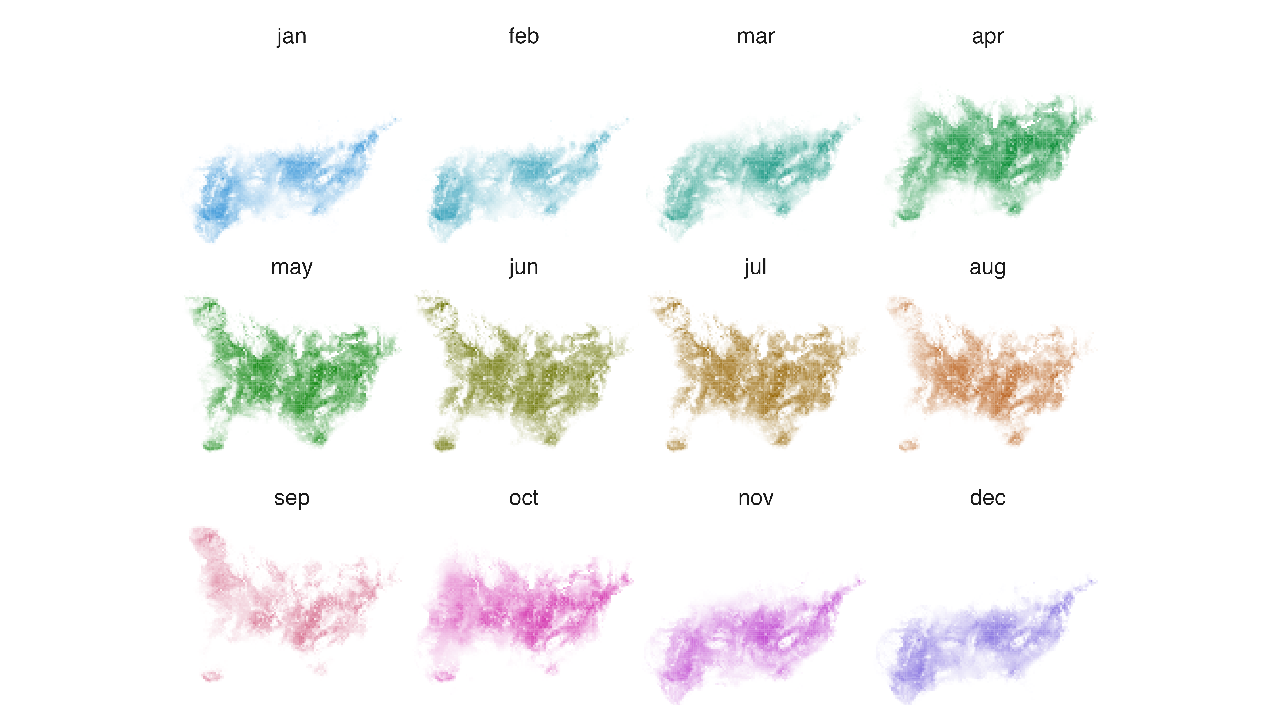
If we want to extract one month of data for closer inspection, we can
use map_single() and specify which month of data we would
like to see using the layer argument.
# map one layer
map_single(m1, p1, layer = 6)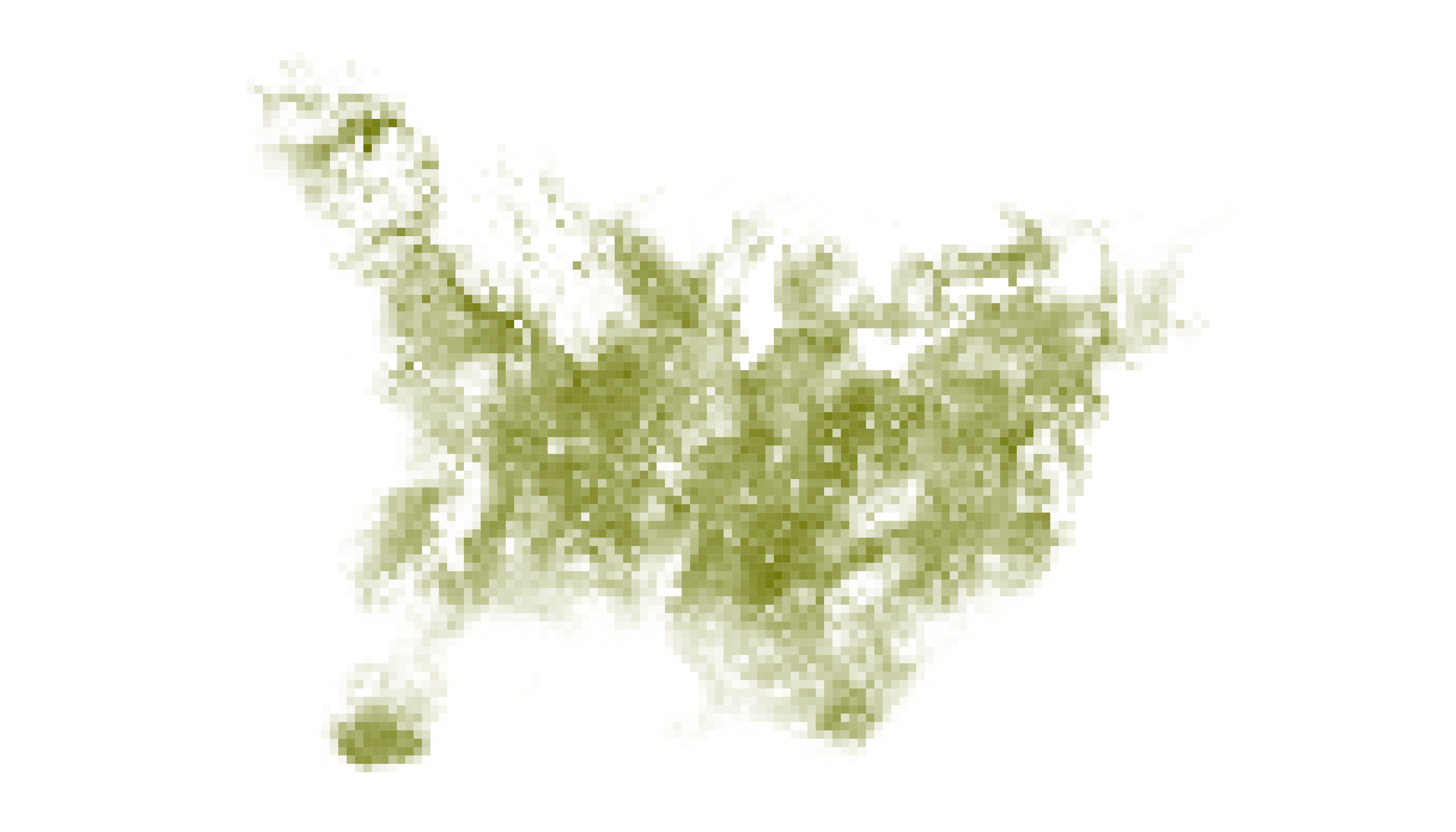
To generate a single annual cycle map that synthesizes spatiotemporal
information about Field Sparrow occurrence, we need to “distill” the
distributional information in our RasterStack using
metrics_distill().
The metrics_distill() function calculates distribution
metrics across all layers in every raster cell and returns three metrics
for subsequent visualization:
- Maximum intensity (i.e., the maximum occurrence, abundance, or density value).
- Layer of maximum intensity (i.e., the identity of the layer containing the maximum intensity value)
- Specificity of the maximum intensity value to the layer of maximum intensity (i.e., the degree to which intensity values are unevenly distributed across layers).
While the maximum intensity and layer of maximum intensity metrics are relatively easy to grasp, the calculation and meaning of “specificity” warrants further explanation. We define specificity according to the following equation:
\[
specificity=50\times \frac{\sum_{l=1}^{n}|y_l-\bar{y}|}{(n-1)\cdot
\bar{y}}
\] where \(n\) indicates the
number of layers in the RasterStack, \(y_l\) is the intensity value in layer \(l\), and \(\bar{y}\) is the mean intensity value
across layers. Specificity values can range from 0 to 100. Values of 0
indicate intensity values are identical in all layers, while values of
100 indicate intensity values are restricted to a single layer.
The interpretation of specificity values depends on the nature of the data layers being explored. In the case of Field Sparrow, where raster layers describe the distribution of a species at different times of the year, specificity can be interpreted as a measure of seasonality (i.e., 0 = stable year-round occurrence in a cell, 100 = highly seasonal occurrence).
After providing metrics_distill() with the
fiespa_occ data, the map_single() function
combines the resulting distribution metrics and palette information to
generate a map.
# distill distribution information across layers
m1_distill <- metrics_distill(fiespa_occ)

# visualize distilled information on a single map
map_single(m1_distill, p1)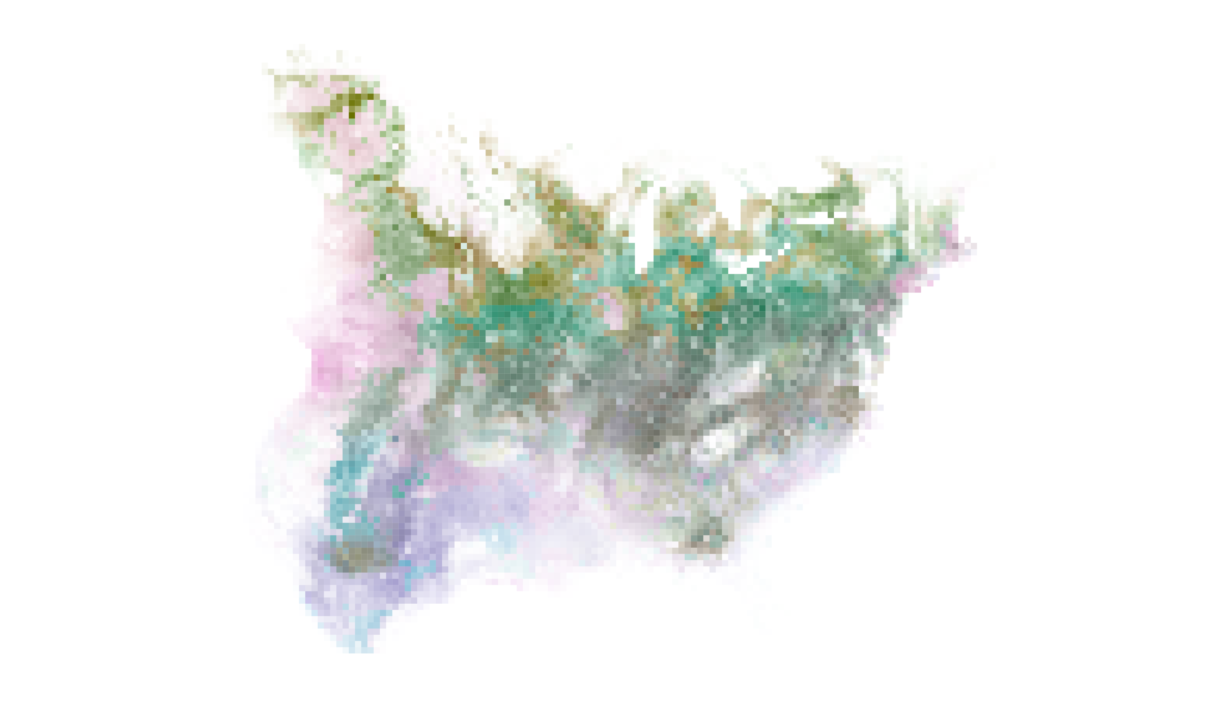
Interpreting annual cycle maps becomes straightforward with a little
experience, but a legend is typically required to orient viewers. We can
generate a legend for the Field Sparrow annual cycle map using
legend_timecycle(), a function that requires a data frame
generated by palette_timecycle(). Information about when
the time cycle begins (and ends) can also be provided in the
origin_label argument. When interpreting the legend and map, remember
that specificity indicates degree of seasonality in Field Sparrow
occurrence.
# generate a legend
legend_timecycle(p1, origin_label = "Jan 1")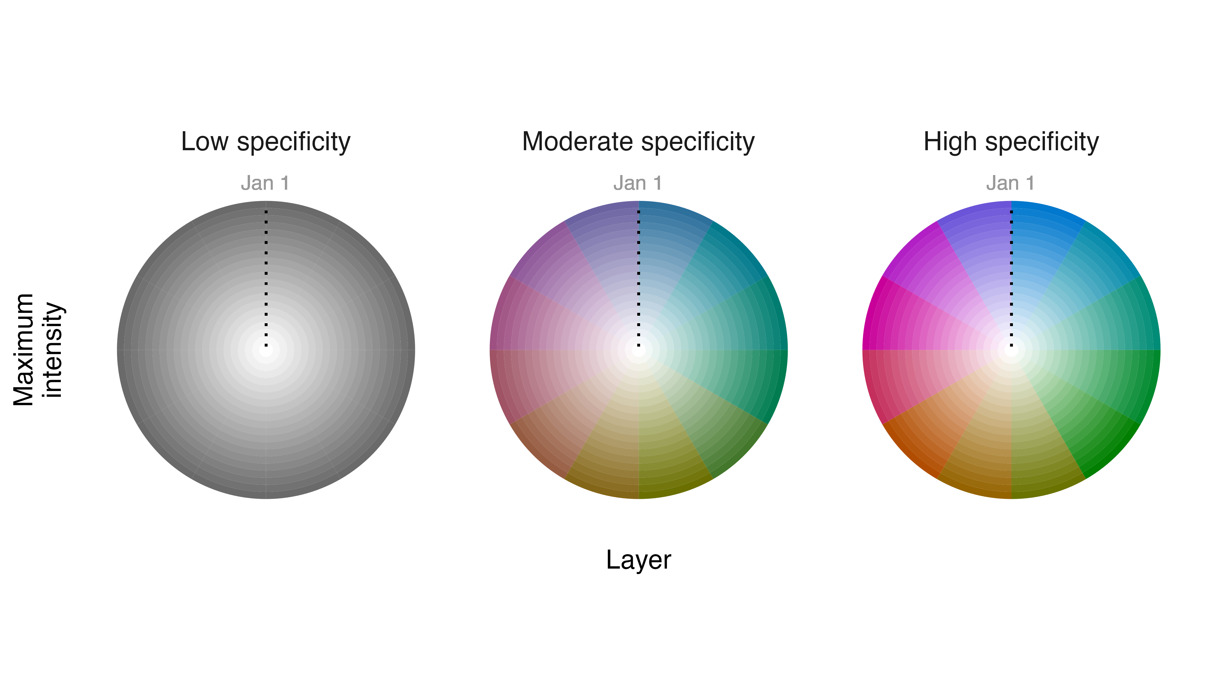
With an annual cycle map and legend in hand, we can now figure out where to find Field Sparrows in space and time. Very colorful cells indicate areas with high occurrence probabilities, but only during specific times of year. For example, rich blue colors towards the bottom of the map indicate that birds occur in those cells with high probability, but almost exclusively in the winter months. In contrast, dark gray areas indicate consistently high occurrence probabilities in cells throughout the year.
2. Map individual behavior over time
Researchers have been placing devices on animals for more than a half century to record individual movements through space and time. In recent years, tracking devices have become smaller, lighter, and increasingly capable of recording data with high spatiotemporal resolution. As a result, it is now possible to understand and communicate how individual animals use their environments in much more detail than was feasible with coarse tracking data and traditional home range maps.
Here, we use colorist to explore how an individual
Fisher (Pekania pennanti) living in upstate New York moved
through its local environment over a period of nine sequential nights in
2011. Fisher are omnivorous mammals in the weasel family that occur in
boreal forests throughout Canada and the United States. They tend to be
solitary throughout most of the year but males and females will
sometimes inhabit overlapping territories.
We start by loading the fisher_ud data set, which
contains utilization distributions calculated for an individual animal
(MP5) on each of nine sequential nights in April 2011. Cell values in
each raster layer indicate the probability density of cell use between
sunset and sunrise.
# loda data
data("fisher_ud")
fisher_ud
#> class      : RasterStack
#> dimensions : 176, 177, 31152, 9  (nrow, ncol, ncell, nlayers)
#> resolution : 25, 25  (x, y)
#> extent     : -2282.343, 2142.657, 5100266, 5104666  (xmin, xmax, ymin, ymax)
#> crs        : +proj=moll +lon_0=-73.4137066015374 +x_0=0 +y_0=0 +ellps=WGS84 +units=m +no_defs
#> names      :      night1,      night2,      night3,      night4,      night5,      night6,      night7,      night8,      night9
#> min values :           0,           0,           0,           0,           0,           0,           0,           0,           0
#> max values : 0.004695207, 0.007591029, 0.006749434, 0.002891691, 0.002833876, 0.004711692, 0.002017082, 0.002700729, 0.005282948
After loading the data, let’s begin by visualizing information in
each of the layers. We do this by “pulling” information from the
RasterStack and combining it with a color palette in
map_multiples(). The Fisher data differ from the Field
Sparrow data in the previous example in that they describe a linear
sequence of distributions, not a cyclical sequence. So, we need to use
palette_timeline() rather than
palette_timecycle() to generate our color palette.
# pull information from the stack
m2 <- metrics_pull(fisher_ud)

# generate a color palette
p2 <- palette_timeline(fisher_ud)

# map each of the layers
map_multiples(m2, p2)
Many of the maps appear relatively washed out because intensity
values in every cell have been scaled relative to the highest intensity
value in the entire RasterStack. It is not uncommon for
distributions to contain highly skewed intensity values because
individual animals spend a vast majority of their time within a
relatively small area or, in the case of species distributions, because
populations are relatively dense during some seasons and relatively
dispersed during others. This can make visualizing distributions a
challenge.
The lambda_i parameter in map_multiples()
and map_single() allows users to visually tune the relative
weights of high and low intensity values using a modulus transformation
(see [scales::modulus_trans()]). In this case, we want to reduce the
disparity between the visual weights of high and low intensity values,
so we set lambda_i = -5.
# map each of the layers and adjust visual weights
map_multiples(m2, p2, lambda_i = -5)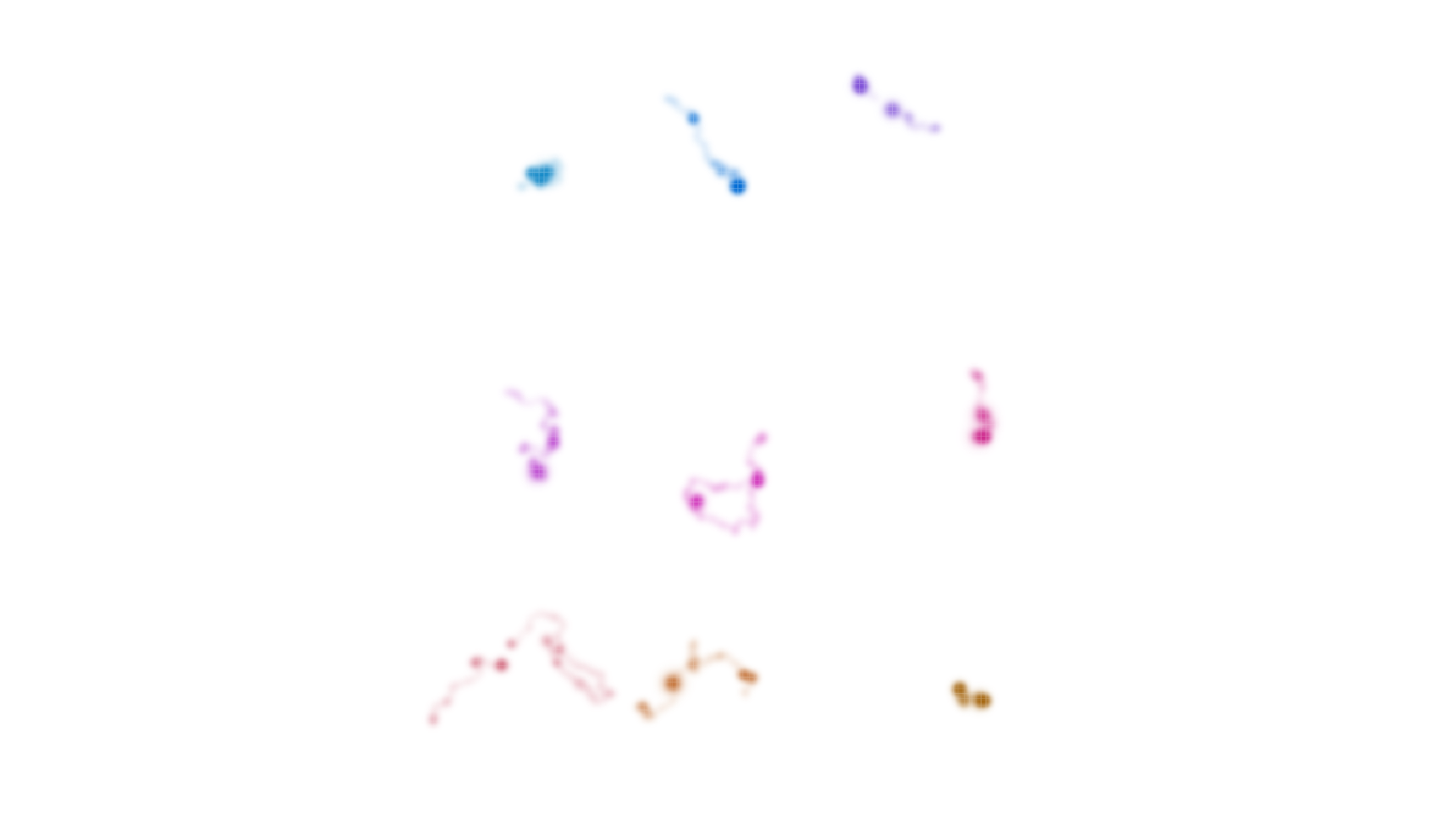
This enables us to better see the places where our focal animal spent
at least some time as it moved across the landscape. To further explore
how MP5 moved throughout its territory over the course of nine nights,
we can “distill” distributional information from across all nine layers
and use the resulting metrics to visualize patterns of space use with
map_single().
It is important to remember that specificity values (and resulting visualization of specificity values) for Fisher should be interpreted differently than for Field Sparrow. Here, specificity values indicate the degree to which MP5 used the same locations within the landscape across nine nights. Low specificity suggests consistent use through time. High specificity suggests very inconsistent or ephemeral use.
# distill distribution information across layers
m2_distill <- metrics_distill(fisher_ud)

# visualize distilled information on a single map
map_single(m2_distill, p2, lambda_i = -5)
Output from legend_timeline() will help to orient
viewers and we can use the time_labels argument to indicate
the ends of the timeline. Looking across the nine nights, MP5 spent
relatively little of its time anchored in one area. The bright colors
seen throughout the map are the result of high specificity values, which
indicate that MP5 explored different parts of its territory almost every
night.
# generate a legend
legend_timeline(p2, time_labels = c("April 7", "April 15"))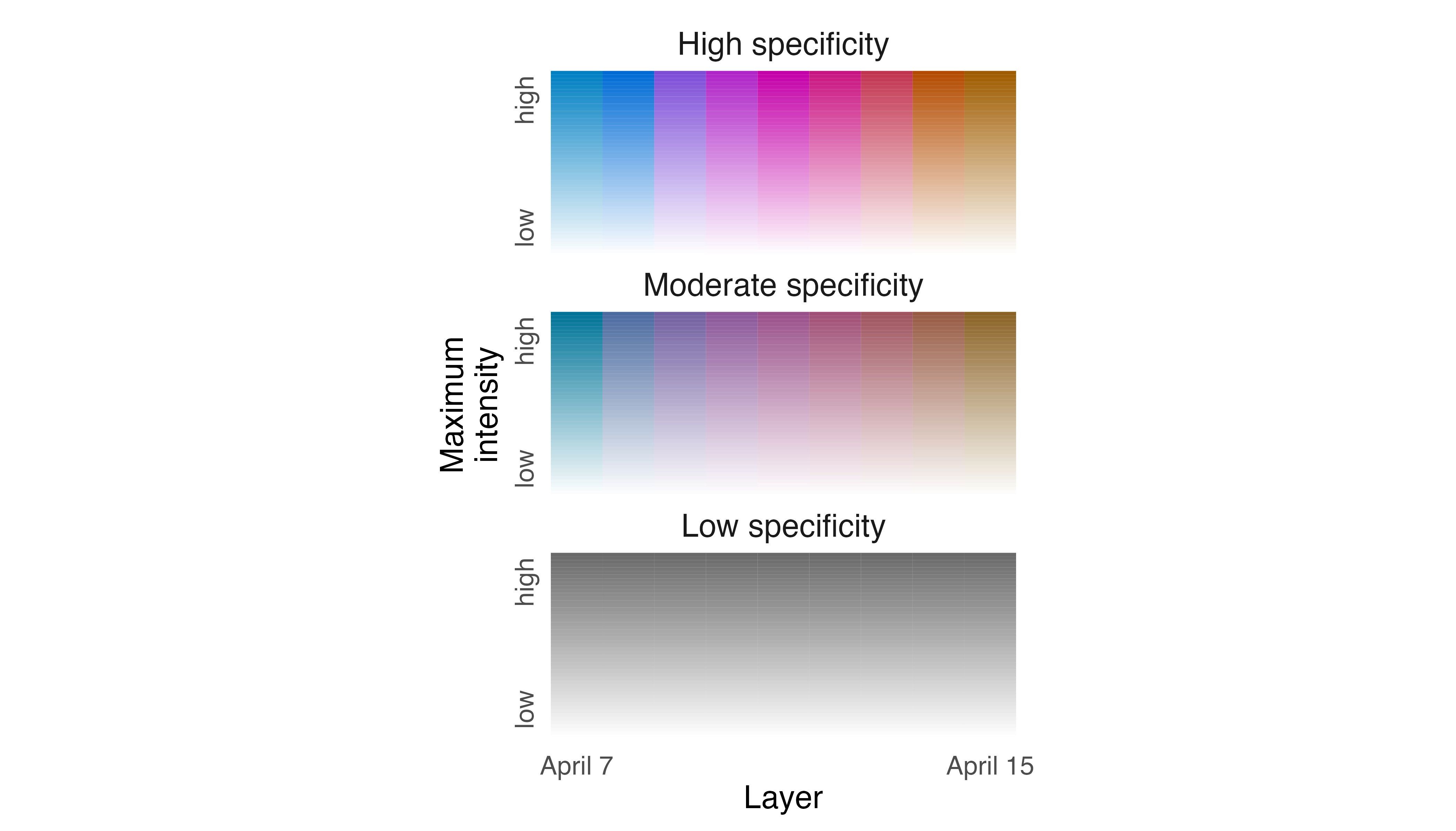
3. Map distributions of multiple individuals during the same time period
In the previous examples, we used colorist to explore
the distributions of a single species and a single individual across
multiple time periods. Other conceptualizations and uses of
colorist functions are possible, however. For example,
colorist can also be used to explore the distribution of
multiple species or individuals within a single time period.
Here, we use GPS tracking data collected from African Elephants (Loxodonta africana) in Etosha National Park, Namibia during 2011 to explore how two individuals used the landscape over the course of a year. The African Elephant is an iconic species with a complex social system that remains a target of poachers throughout much of Africa. Many populations of African Elephants move seasonally along specific migratory routes, tracking availability of seasonally abundant resources.
To begin, we load the elephant_ud data set which
contains utilization distributions for two individual elephants (LA11
and LA14) during 2011. Because the utilization distributions form an
unordered set (i.e., they need not be presented in any specific cyclical
or linear sequence), we use the palette_set() function to
assign them colors. Then, we map the two distributions using
map_multiples() while adding visual emphasis to rarely used
areas with the lambda_i argument and adding identifiers to
each map with the labels argument.
# load data
data("elephant_ud")

# pull information from the stack
m3 <- metrics_pull(elephant_ud)

# assign a color palette
p3 <- palette_set(elephant_ud)

# generate maps for each individual
map_multiples(m3, p3, ncol = 2, lambda_i = -5, labels = names(elephant_ud))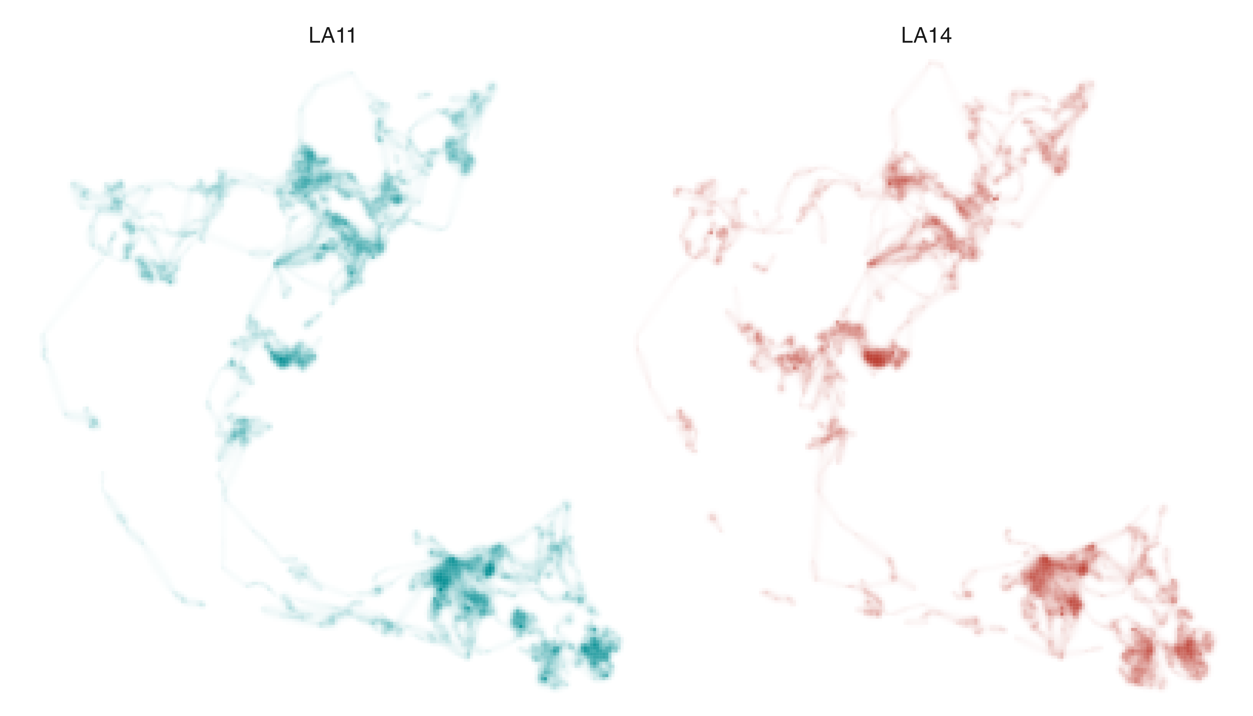
The utilization distributions for LA11 and LA14 look remarkably
similar at first glance, which is not surprising given the two elephants
belong to the same herd. However, we can more clearly understand the
similarities and differences in how they used space in 2011 by
“distilling” distributional information from across the two raster
layers with metrics_distill() and visualizing the resulting
metrics with map_single().
Before generating the map, however, we should recalibrate our understanding of what specificity values mean based on the nature of the data we are exploring. In contrast to the Field Sparrow and Fisher examples, where specificity indicated the degree to which intensity values were inconsistent (or consistent) through time, here specificity values can be interpreted as a measure of differential use of the landscape. Very low specificity values indicate equal use of a cell by both individuals; very high specificity values indicate exclusive use by one individual.
Accordingly, if the two utilization distributions were identical, we
would expect map_single() to produce a range of gray values
indicating where the pair spent relatively more or less time. There
would not be any blue or red cells indicating areas were being used
differentially. In contrast, if the two distributions were only
superficially similar then we would expect map_single() to
produce blue and red cells indicating exclusive use of areas by each
individual, and very few gray cells indicating equal use.
# distill distribution information across individuals
m3_distill <- metrics_distill(elephant_ud)

# visualize distilled information on a single map
map_single(m3_distill, p3, lambda_i = -5)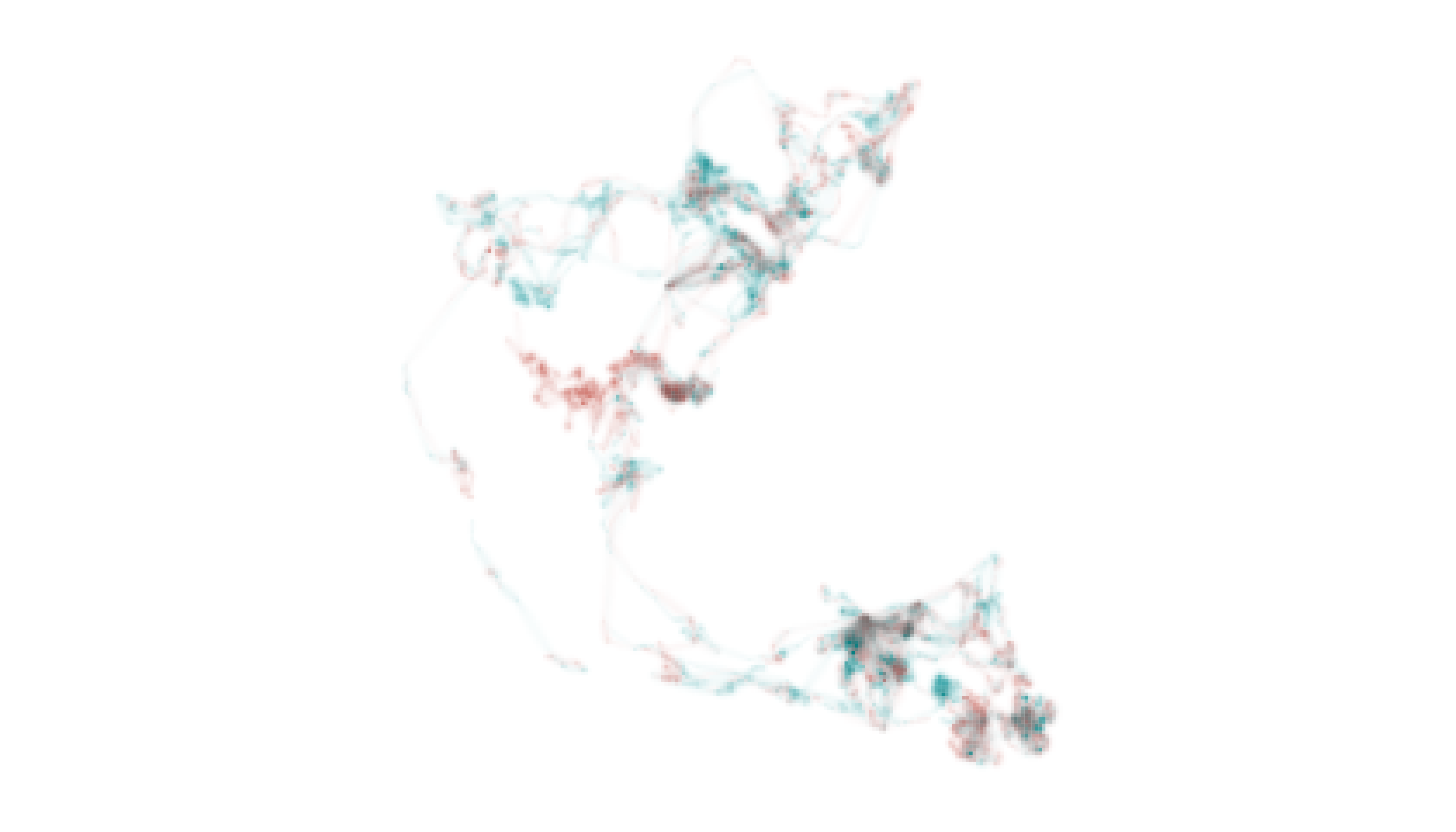
# generate a legend
legend_set(p3, group_labels = names(elephant_ud))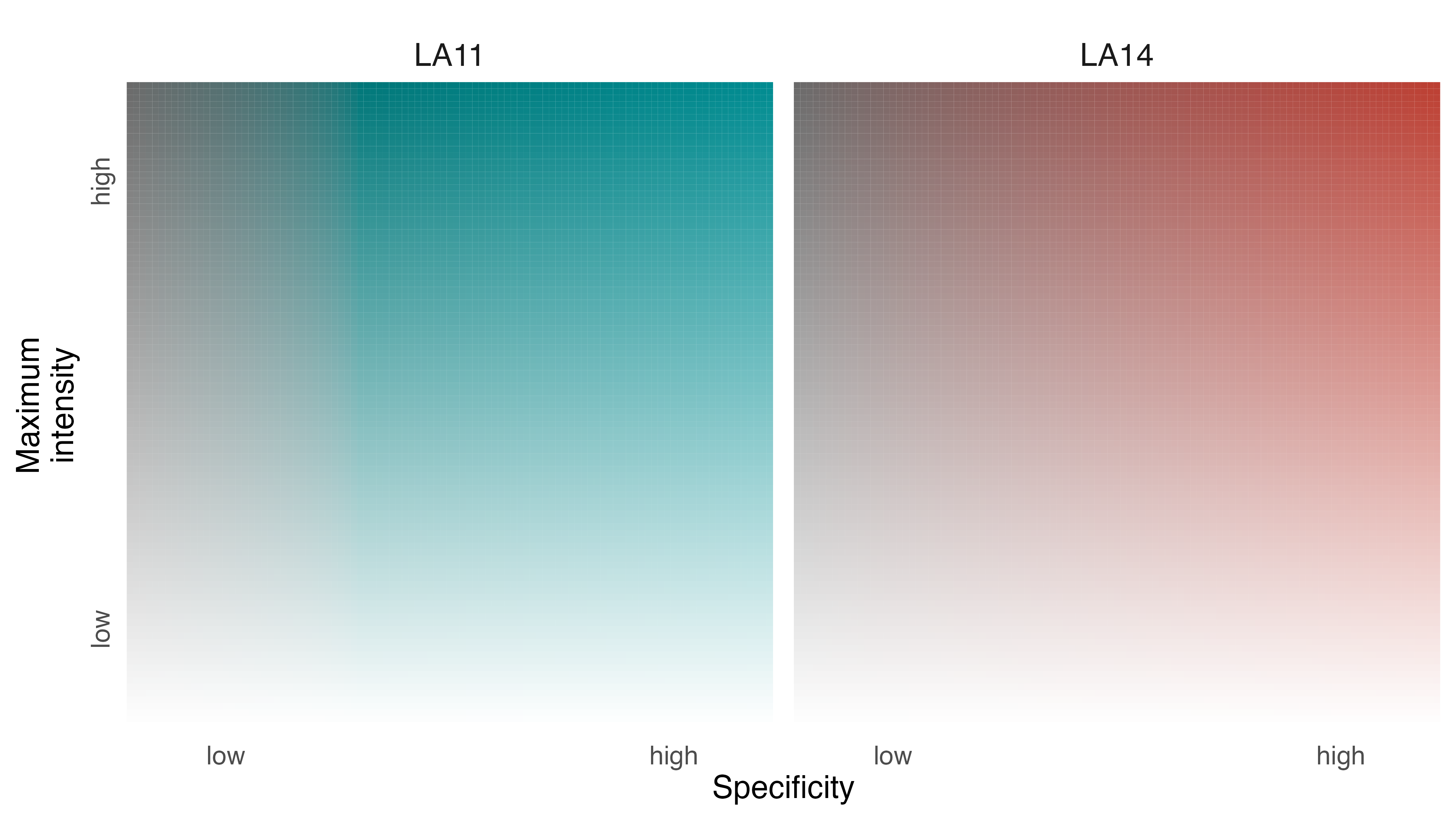
Despite the general similarity of the two utilization distributions, some places were used almost exclusively by LA11 (i.e., blue cells) and others were used almost exclusively by LA14 (i.e., red cells). We can contextualize these patterns by adding information about the locations of pans, waterholes, roads, and boundaries to the map. These environmental data layers can be downloaded as a GeoPackage from the package GitHub repository, which we do below.
# download data to a temp directory
url <- "https://github.com/mstrimas/colorist/raw/master/data-raw/"
f <- file.path(tempdir(), "etosha-features.gpkg")
download.file(paste0(url, basename(f)), f)
We can then read the spatial data from the GeoPackage into R and ensure that the data are described by the same coordinate reference system as the elephant data.
pans <- read_sf(f, layer = "pans") %>%
  st_transform(crs = st_crs(elephant_ud))

waterholes <- read_sf(f, layer = "waterholes") %>%
  st_transform(crs = st_crs(elephant_ud))

park <- read_sf(f, layer = "etosha") %>%
  st_transform(crs = st_crs(elephant_ud))

roads <- read_sf(f, layer = "roads") %>%
  st_transform(crs = st_crs(elephant_ud))
Then we use map_single() to reproduce our map of LA11
and LA14 distributions, but we append geom_sf() line
objects to our map_single() function. These additional
lines of code allow us to add environmental context to our underlying
elephant map (which is a ggplot object) and communicate
additional information about how elephants LA11 and LA14 navigate Etosha
National Park.
# visualize both distributions on a single map and add environmental data
elephant_map <- map_single(m3_distill, p3, lambda_i = -5) +
  geom_sf(data = pans, alpha = 0.2, size = 0.15, color = "gray40") +
  geom_sf(data = waterholes, size = 0.25) +
  geom_sf(data = park, size = 3, fill = NA, color = alpha("gray60", 0.2)) +
  geom_sf(data = park, size = 0.2, fill = NA, color = "gray20", linetype = 6) +
  ggtitle("Two Elephants in Etosha National Park")

# show the map
elephant_map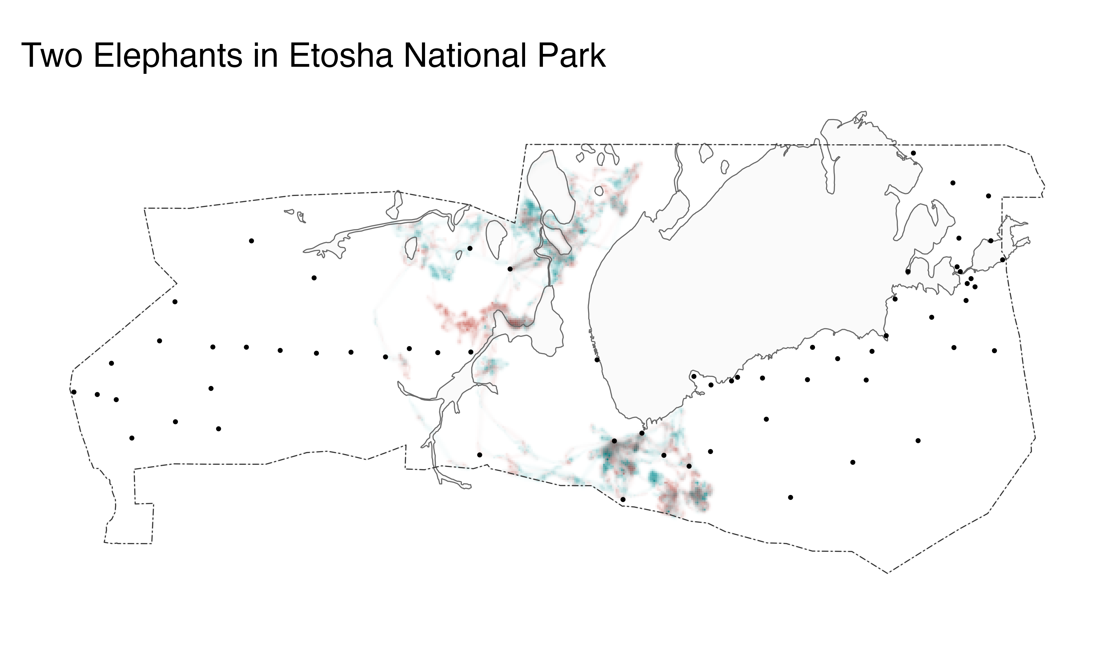
The resulting map object (elephant_map) could be saved
using the ggsave() function.
# save the map
ggsave(plot = elephant_map,
       filename = "afrele_map_singles.png",
       width = 6,
       height = 3.5,
       dpi = 600)