In the Introduction
to colorist and Tuning
visualizations in colorist vignettes, we provided an overview of
colorist functionality and explored how users might adjust
visualizations to address specific narrative goals. Here, we focus on
several issues that users may confront when making finished
visualizations:
- Adding context to
coloristmaps using supplementary spatial data - Modifying
coloristlegends - Displaying
coloristmaps in other R spatial packages and external GIS software
We start by loading the necessary libraries.
library(colorist)
library(ggplot2)
library(raster)
library(rnaturalearth)
library(sf)
library(tigris)
1. Adding context
It’s easy to imagine users wanting to add context to visualizations
generated by colorist, to help explain the causes of
particular spatiotemporal distributions. Here, we focus on showing how
Natural Earth and US Census TIGER/Line data can be accessed from within
R and incorporated into colorist maps.
rnaturalearth package
Natural Earth is a public domain data set that contains vector and
raster data developed for display at several different map scales. Files
describing physical and cultural geographies can be accessed through R
using functions in the rnaturalearth package. Here, we
download Natural Earth vector data and add it to a map describing the
spatiotemporal distribution of Field Sparrow, a small bird that occurs
in the eastern United States. We begin by calculating distribution
metrics for Field Sparrow with metrics_distill(), choosing
a palette with palette_timecycle(), and creating a map with
map_single(). Note that we choose to save the
ggplot2 map as an object.
# calculate metrics, choose a palette, make a map
m_fiespa <- metrics_distill(fiespa_occ)
p_fiespa <- palette_timecycle(fiespa_occ)
map_fiespa <- map_single(m_fiespa, p_fiespa)
Then, we use the ne_download() function from
rnaturalearth to download country, river, and lake spatial
data as sf (simple features) objects, which are easy to
incorporate into our existing map. In the process, we project and crop
each data set to the same projection and extent as our Field Sparrow
data. To avoid annoying topology and projection issues, we create our
own ocean polygon by calculating the difference between a polygon
describing the extent of the Field Sparrow map and the polygon
describing countries.
# download, transform, and crop spatial data
countries <- ne_download(category = "cultural", type = "countries",
                         returnclass = "sf", scale = 110) %>%
  st_transform(crs = st_crs(fiespa_occ)) %>%
  st_crop(st_bbox(fiespa_occ))

rivers <- ne_download(category = "physical", type = "rivers_lake_centerlines",
                      returnclass = "sf", scale = 110) %>%
  st_transform(crs = st_crs(fiespa_occ)) %>%
  st_crop(st_bbox(fiespa_occ))

lakes <- ne_download(category = "physical", type = "lakes", returnclass = "sf",
                     scale = 110) %>%
  st_transform(crs = st_crs(fiespa_occ)) %>%
  st_crop(st_bbox(fiespa_occ))

# create polygon describing ocean
ocean <- st_as_sfc(st_bbox(fiespa_occ)) %>%
  st_difference(st_union(countries))
We add the supplementary spatial data to the map by appending
geom_sf() elements to the underlying map and symbolizing
each element according to our specifications. We also add a bounding
rectangle to our map.
# add supplementary spatial data to map
map_fiespa_ne <- map_fiespa +
  geom_sf(data = ocean, fill = "gray95", color = "black", size = 0.25) +
  geom_sf(data = rivers, size = 0.25, color = "gray35") +
  geom_sf(data = lakes, fill = "gray95", size = 0.25, color = "gray35") +
  geom_sf(data = st_as_sfc(st_bbox(fiespa_occ)), fill = NA, color = "black",
          size = 0.25)

# show the map
print(map_fiespa_ne)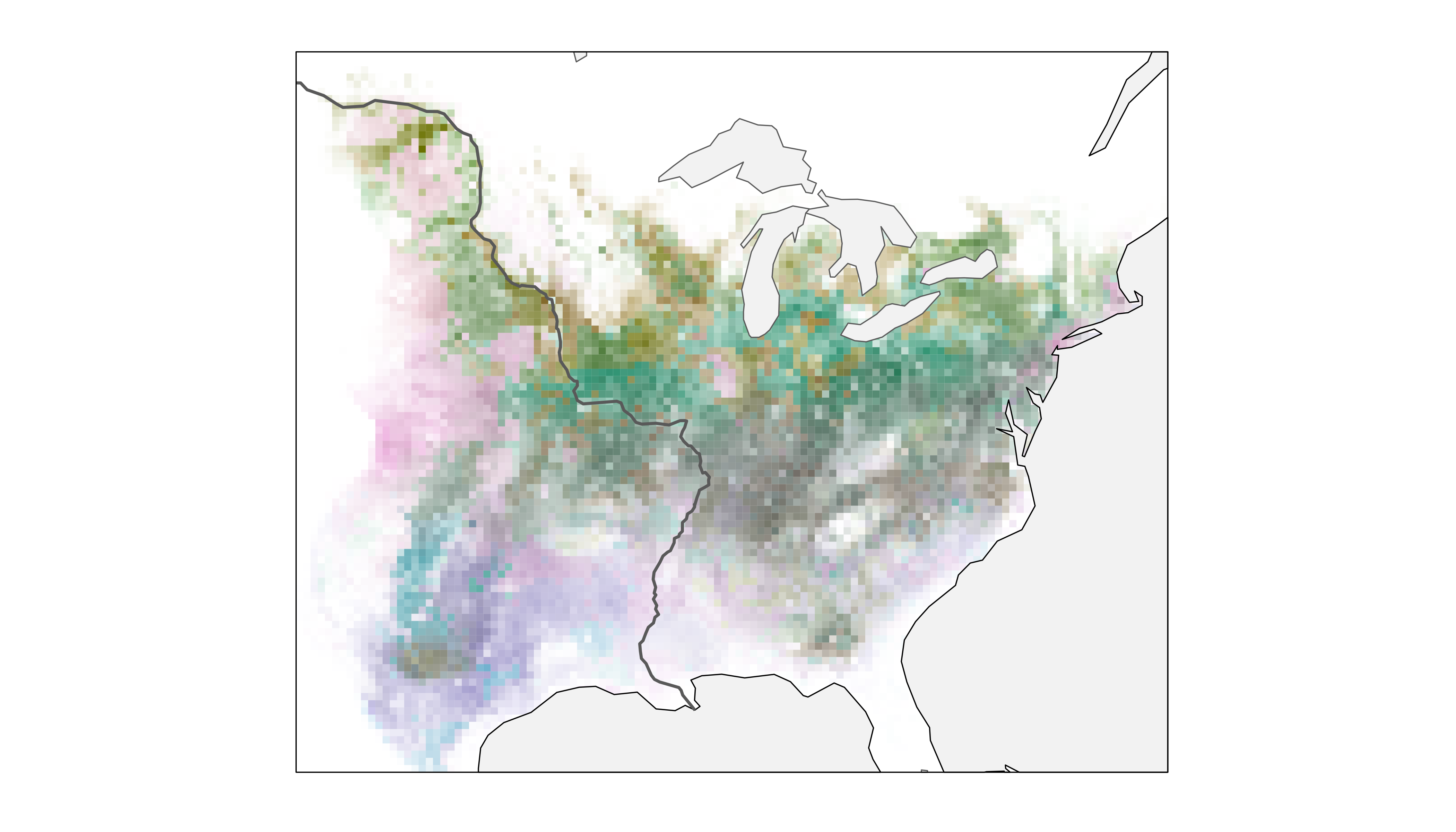
Now, we have a clearer perspective on the spatiotemporal distribution of Field Sparrow in relation to a variety of easily recognizable geographic features in North America.
tigris package
Next, we integrate spatial data from the tigris package
into a map describing Fisher use of a territory in upstate New York over
the course of nine nights. The tigris package enables
download of TIGER/Line data generated by the United States Census
Bureau. Files detail a wide array of geographic features, area
delineations, and place names throughout the United States.
In contrast to the previous example, we start by using the
metrics_pull(), palette_timeline(), and
map_multiples() functions to visualize individual raster
layers from the Fisher data set. We adjust lambda_i within
map_multiples() to emphasize areas that were used only
briefly by the Fisher.
# calculate metrics, choose a palette, make a series of maps
m_fisher <- metrics_pull(fisher_ud)
p_fisher <- palette_timeline(9, start_hue = -40)
map_fisher <- map_multiples(m_fisher, p_fisher, lambda_i = -5,
                            labels = paste("April", 7:15))
To download spatial data using tigris we need to know
that the Fisher study area is located in Rensselaer County, New York.
Then, we can access linear water features, areal water features, and
roads for the county using tigris functions, projecting and
cropping our supplementary spatial data along the way.
tigris functions provide data formatted as sf
objects.
# download, transform, and crop spatial data
streams <- linear_water("NY", "Rensselaer") %>%
  st_transform(crs = st_crs(fisher_ud)) %>%
  st_crop(st_bbox(fisher_ud))

ponds <- area_water("NY", "Rensselaer") %>%
  st_transform(crs = st_crs(fisher_ud)) %>%
  st_crop(st_bbox(fisher_ud))

roads <- roads("NY", "Rensselaer") %>%
  st_transform(crs = st_crs(fisher_ud)) %>%
  st_crop(st_bbox(fisher_ud))
As in the previous example, we add our spatial data to the underlying
colorist map using geom_sf() elements and we
add an unobtrusive bounding box to more clearly define the facets of our
plot.
# add supplementary spatial data to the series of maps
map_fisher +
  geom_sf(data = streams, linetype = 6, color = "lightblue4", size = 0.25) +
  geom_sf(data = ponds, linetype = 6, color = "lightblue4", fill = "lightblue",
          size = 0.25) +
  geom_sf(data = roads, size = 0.25, color = alpha("black", 0.5)) +
  geom_sf(data = st_as_sfc(st_bbox(fisher_ud)), fill = NA, color = "gray",
          size = 0.25)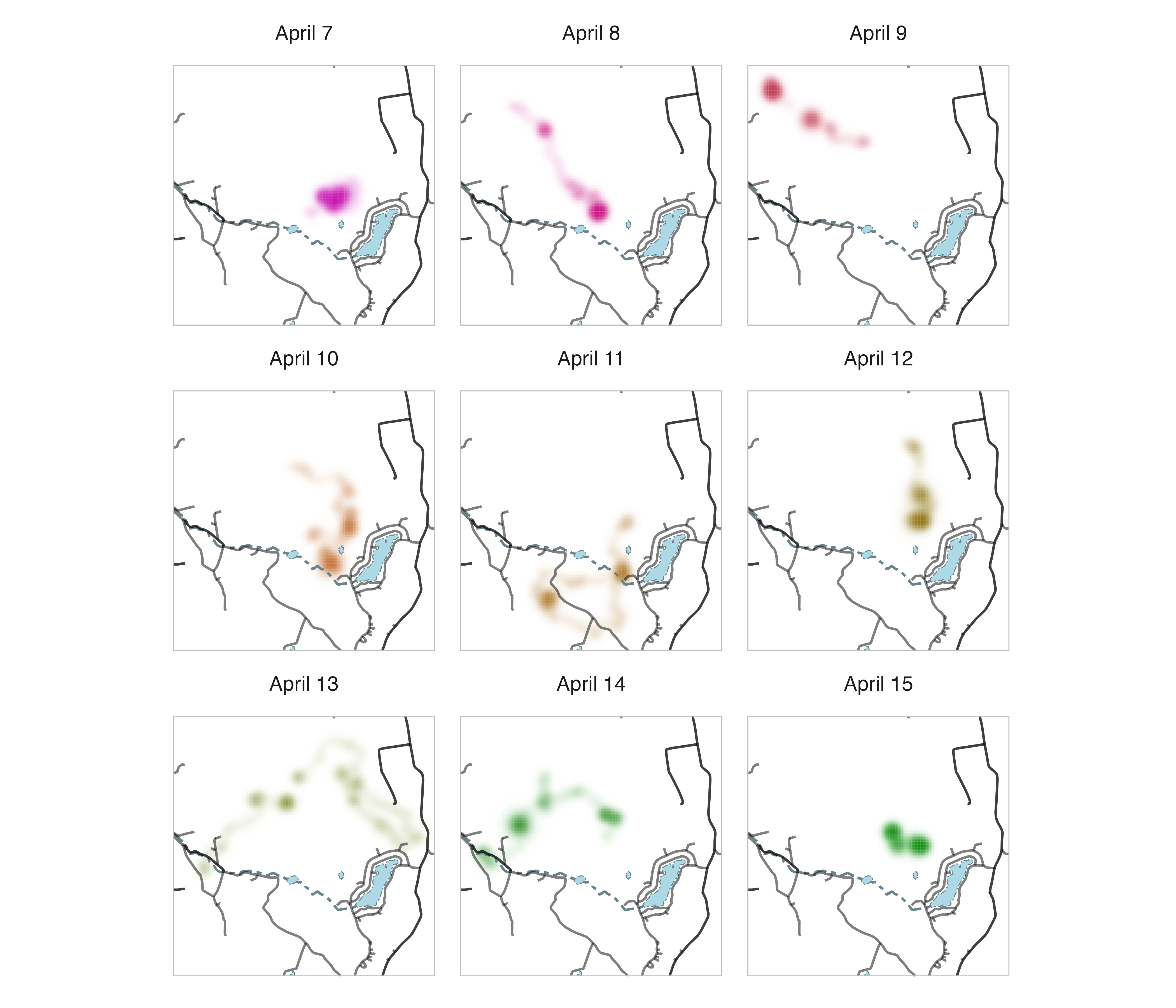
Now we can clearly see how the Fisher moved throughout its territory across nights and in relation to the locations of roads, streams, and ponds.
General comments
We recommend trying to keep a “light touch” with edits to
colorist maps to ensure that information about
spatiotemporal distributions remains the focus. In addition, it’s
important to keep in mind that colorist visualizations rely
on differences in cell opacity to communicate information about
differences in intensity; changing the plot background color from white
will make the map difficult to interpret.
2. Modifying legends
The legend functions in colorist generate
ggplot2 plot objects, some of which are fairly complicated.
Here, we focus on modifying legends to aid interpretation and combining
legends and maps within a ggplot2 framework.
legend_timecyle()
When we make a legend for the Field Sparrow annual cycle map described above, the default settings do not communicate the meanings of intensity, specificity, or layer very clearly.
# create a legend using default settings
legend_timecycle(p_fiespa)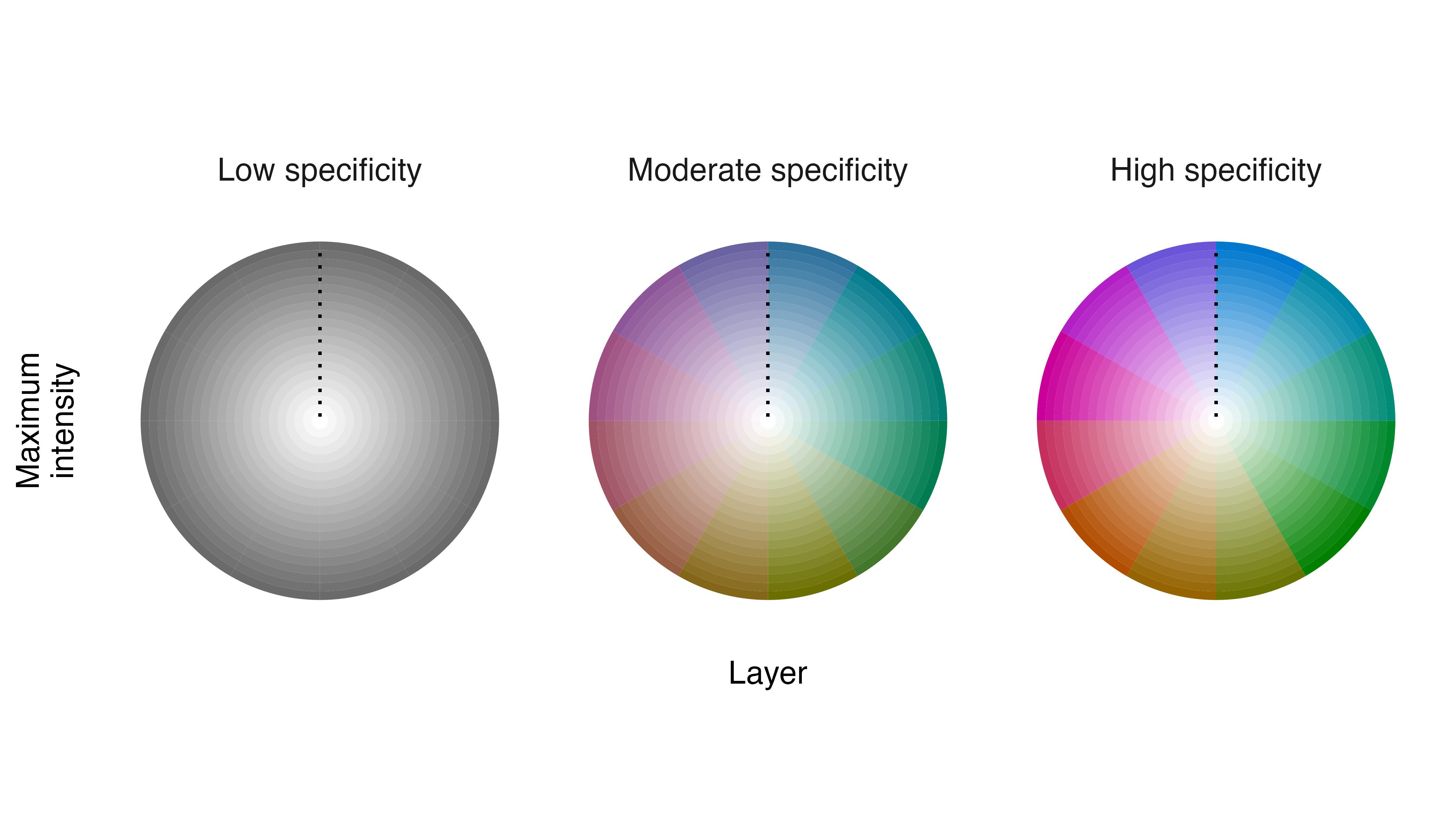
Remember, we have distilled distribution metrics from a stack of
monthly occurrence probabilities, so intensity values represent maximum
occurrence throughout the year, specificity values indicate the degree
of seasonality in occurrences, and layer values reveal the month of
maximum occurrence. We can edit the legend to clarify these
interpretations by making several changes in the
legend_timecycle() function.
# change labels on legend
l_fiespa <- legend_timecycle(p_fiespa,
                             origin_label = "Jan 1",
                             # specificity labels
                             label_s = c("Low\nseasonality",
                                         "Moderate\nseasonality",
                                         "High\nseasonality"),
                             # intensity label
                             label_i = "Peak occurrence",
                             # layers label
                             label_l = "Month of peak occurrence")

# show legend
print(l_fiespa)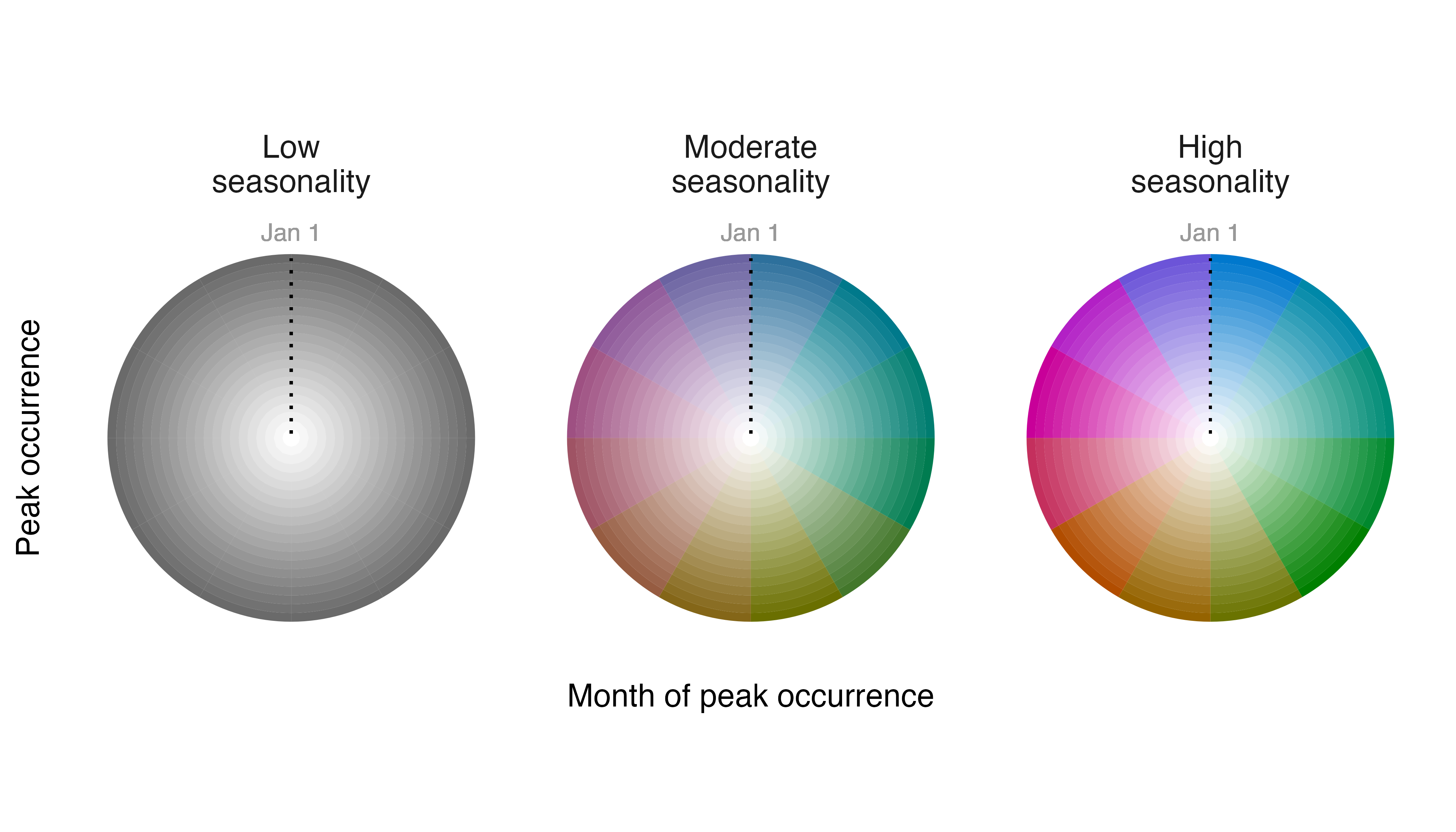
Better.
Now, we need to decide where to position the legend in relation to
the map describing the spatiotemporal distribution of Field Sparrow.
After playing with several ideas, we place the legend beneath the main
map. This requires expanding the spatial extent of the plot using the
coord_sf() function and then inserting the legend into the
“empty landscape” using annotation_custom(). Note that the
values in coord_sf() and annotation_custom()
are in projected map coordinates.
# position legend below map
map_fiespa_ne +
  coord_sf(ylim = c(-3153281, 1405830)) +
  annotation_custom(ggplotGrob(l_fiespa),
                    xmin = -1482551, xmax = 1850606,
                    ymin = -3153281, ymax = -1453281)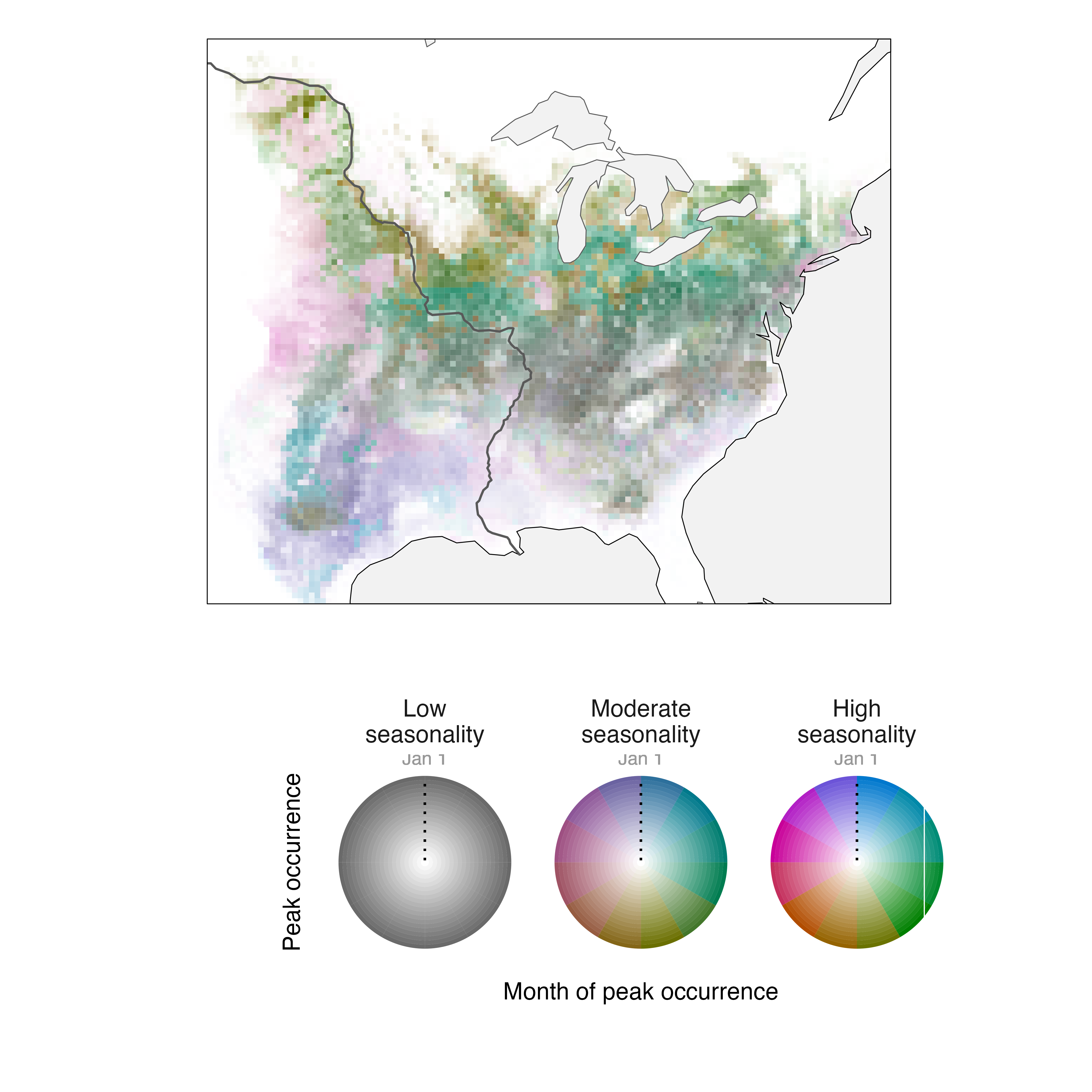
legend_timeline()
The strategy for editing details of legend_timeline()
plots is similar to that for legend_timecycle() plots,
despite differences in their layouts. Before changing the legend,
however, we should use metrics_distill() and
map_single() to describe Fisher use of its territory over
nine nights in a single map. Because we’re making one larger map, we’re
also going to add another layer of spatial data describing building
footprints in the area. These features come from the OpenStreeMap
Microsoft Building Footprint dataset, a cropped and projected copy
of which is available
on the GitHub repository for this package.
# calculate distribution metrics
m_fisher_distill <- metrics_distill(fisher_ud)

# download building footprints
f_buildings <- file.path(tempdir(), "buildings.rds")
download.file(paste0("https://github.com/mstrimas/colorist/raw/master/",
                     "data-raw/buildings.rds"),
              f_buildings)
buildings <- readRDS(f_buildings)
unlink(f_buildings)

# make a map
map_fisher_distill <- map_single(m_fisher_distill, p_fisher,
                                 lambda_i = -5, lambda_s = 10) +
  geom_sf(data = streams, linetype = 6, color = "lightblue4", size = 0.25) +
  geom_sf(data = ponds, linetype = 6, color = "lightblue4", fill = "lightblue",
          size = 0.25) +
  geom_sf(data = roads, size = 0.25, color = alpha("black", 0.5)) +
  geom_sf(data = buildings, size = 0.25, color = alpha("black", 0.5)) +
  geom_sf(data = st_as_sfc(st_bbox(fisher_ud)), fill = NA, color = "black",
          size = 0.25)

# show the map
print(map_fisher_distill)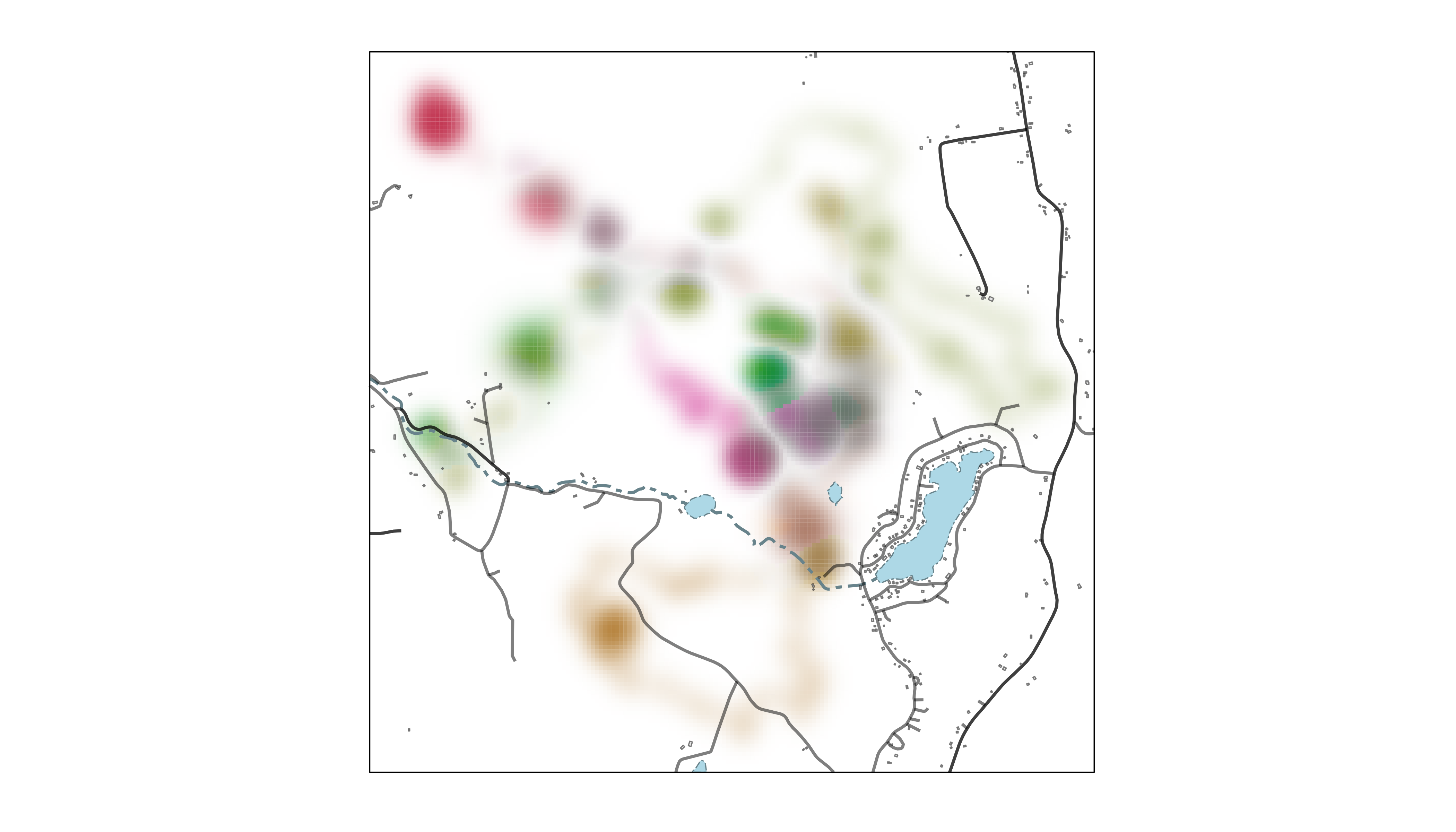
Setting lambda_i = -5 makes rarely used parts of the
landscape more conspicuous and setting lambda_s = 10
emphasizes differences in how consistently areas were used across
nights. Spatial data for Rensselaer County are added to the map using
geom_sf() elements, just as in the previous section.
Now, let us generate a default legend for our Fisher data using
legend_timeline().
# create a legend using default settings
legend_timeline(p_fisher)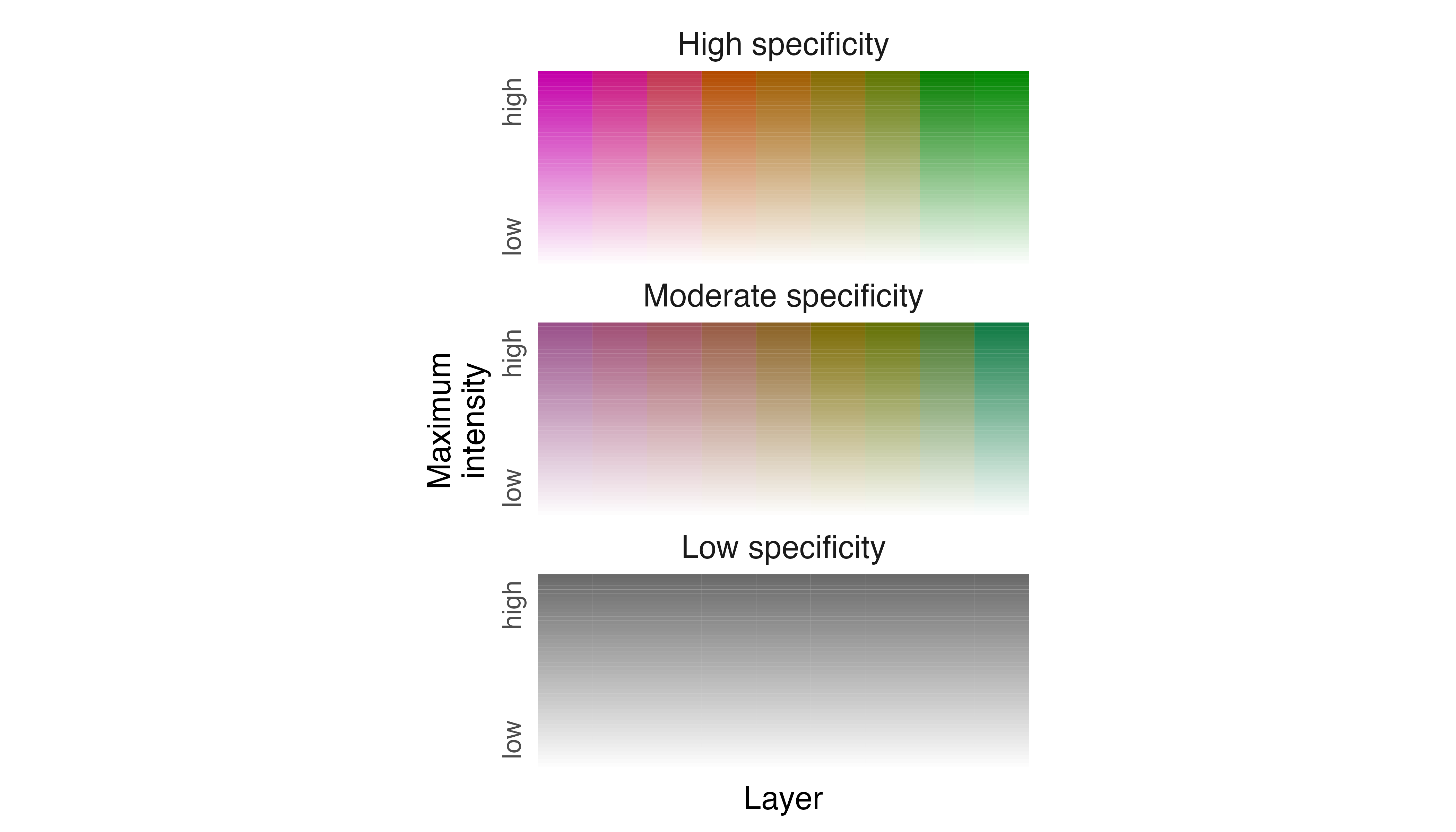
To make the legend more helpful as a guide to interpreting the
spatiotemporal distribution of the Fisher, we need to edit intensity,
specificity, and layer labels. So, we modify label_s,
label_i, and label_l in
legend_timeline() to reflect their meanings with respect to
the Fisher data. We also prescribe how the ends of the timeline are
labeled using thetime_labels argument.
# change labels of legend
l_fisher <- legend_timeline(p_fisher,
                            time_labels = c("Apr 7", "Apr 15"),
                            # intensity label
                            label_i = "Peak use",
                            # layer label
                            label_l = "Night of peak use",
                            # specificity labels
                            label_s = c("Consistent use", "Occasional use", "Ephemeral use"))

# show legend
print(l_fisher)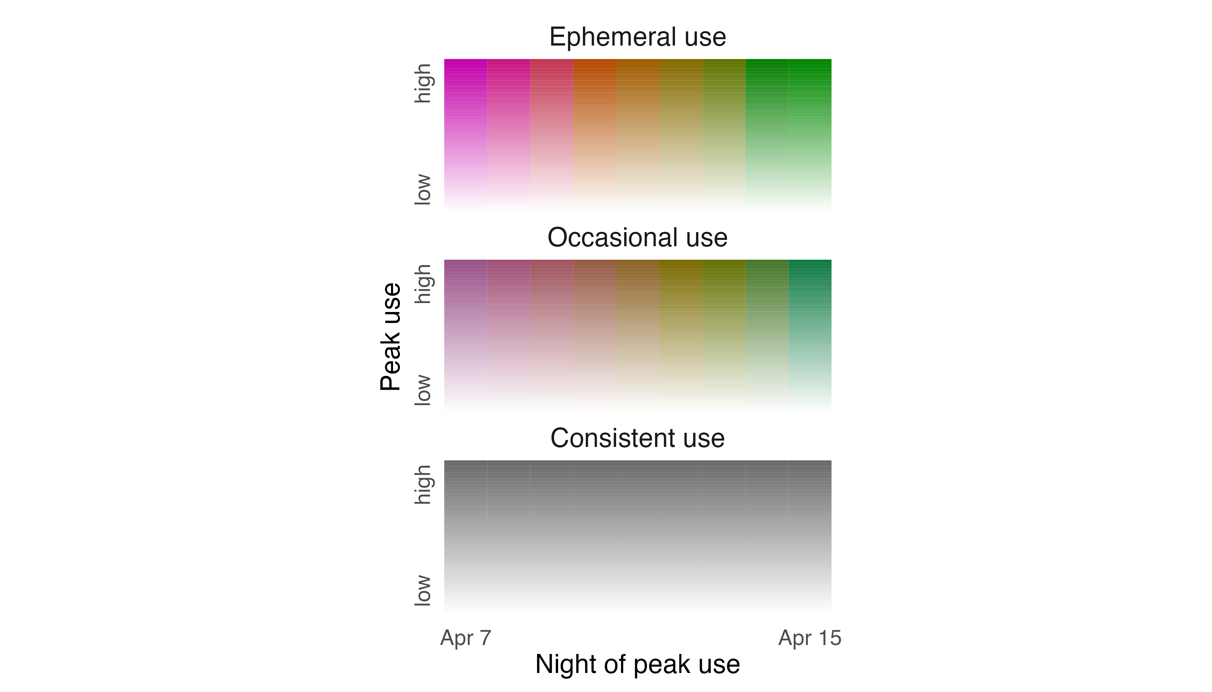
To place our legend next to the map, we expand the extent of our plot
by modifying coord_sf() and we specify its position using
the annotation_custom() function.
# position legend to the left of the map
map_fisher_distill +
  coord_sf(xlim = c(-4300, 2150)) +
  annotation_custom(ggplotGrob(l_fisher),
                    xmin = -4400, xmax = -2500,
ymin = 5100266, ymax = 5104666) 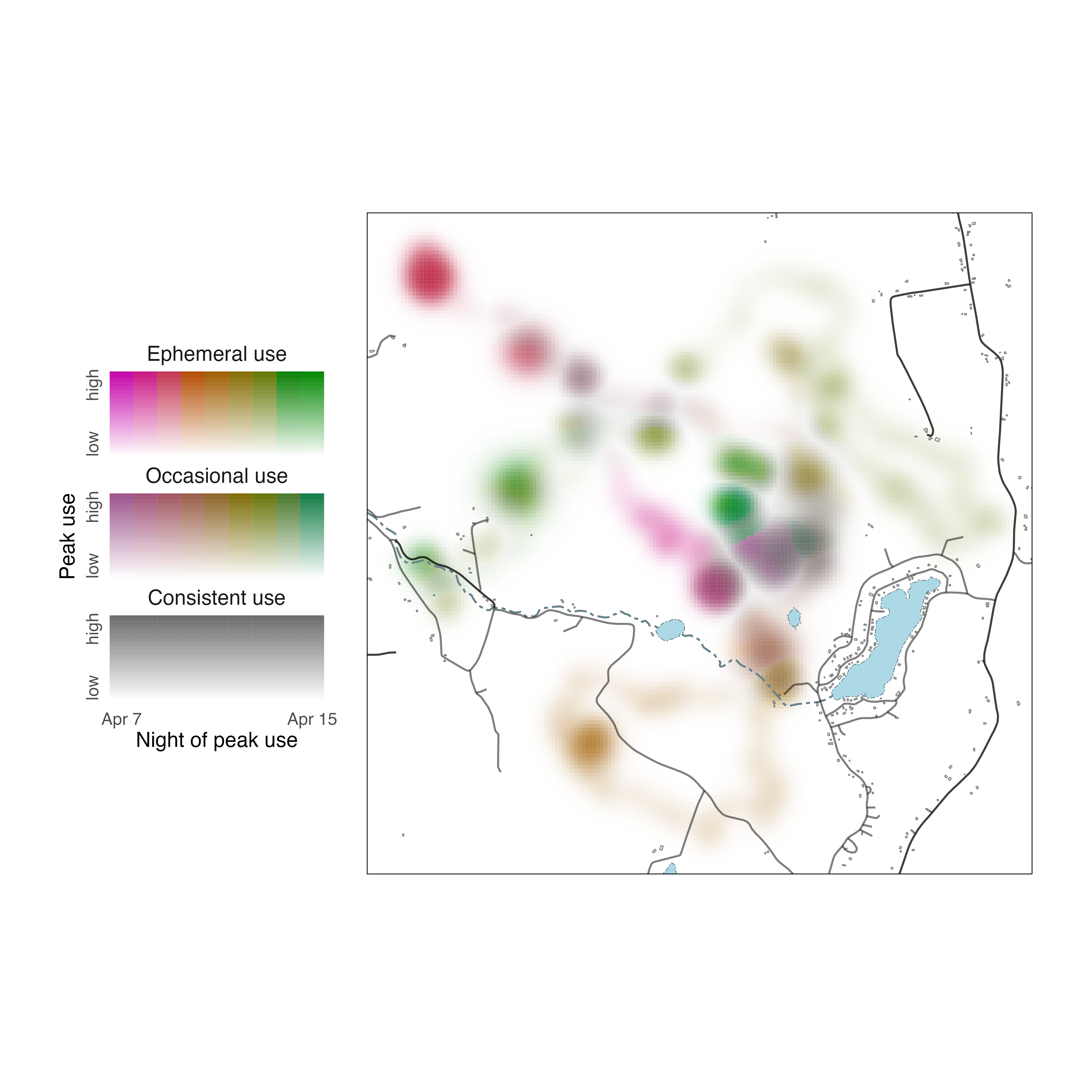
legend_set()
Here, we return to data describing the utilization distributions of
two African Elephants in Etosha National Park in 2011. The two layers of
the RasterStack form an unordered set of distributions, one for each
individual. To visualize how the elephants partitioned space, we begin
by calculating distribution metrics using
metrics_distill(), creating a palette with
palette_set(), and generating a map with
map_single(). We add visual emphasis to rarely used areas
via the lambda_i argument.
# calculate metrics, choose a palette, make a series of maps
m_elephants <- metrics_distill(elephant_ud)
p_elephants <- palette_set(elephant_ud)
map_elephants <- map_single(m_elephants, p_elephants, lambda_i = -5)
This should all seem familiar.
Next, we build a legend using our palette and the default settings in
legend_set().
# create a legend using default settings
legend_set(p_elephants)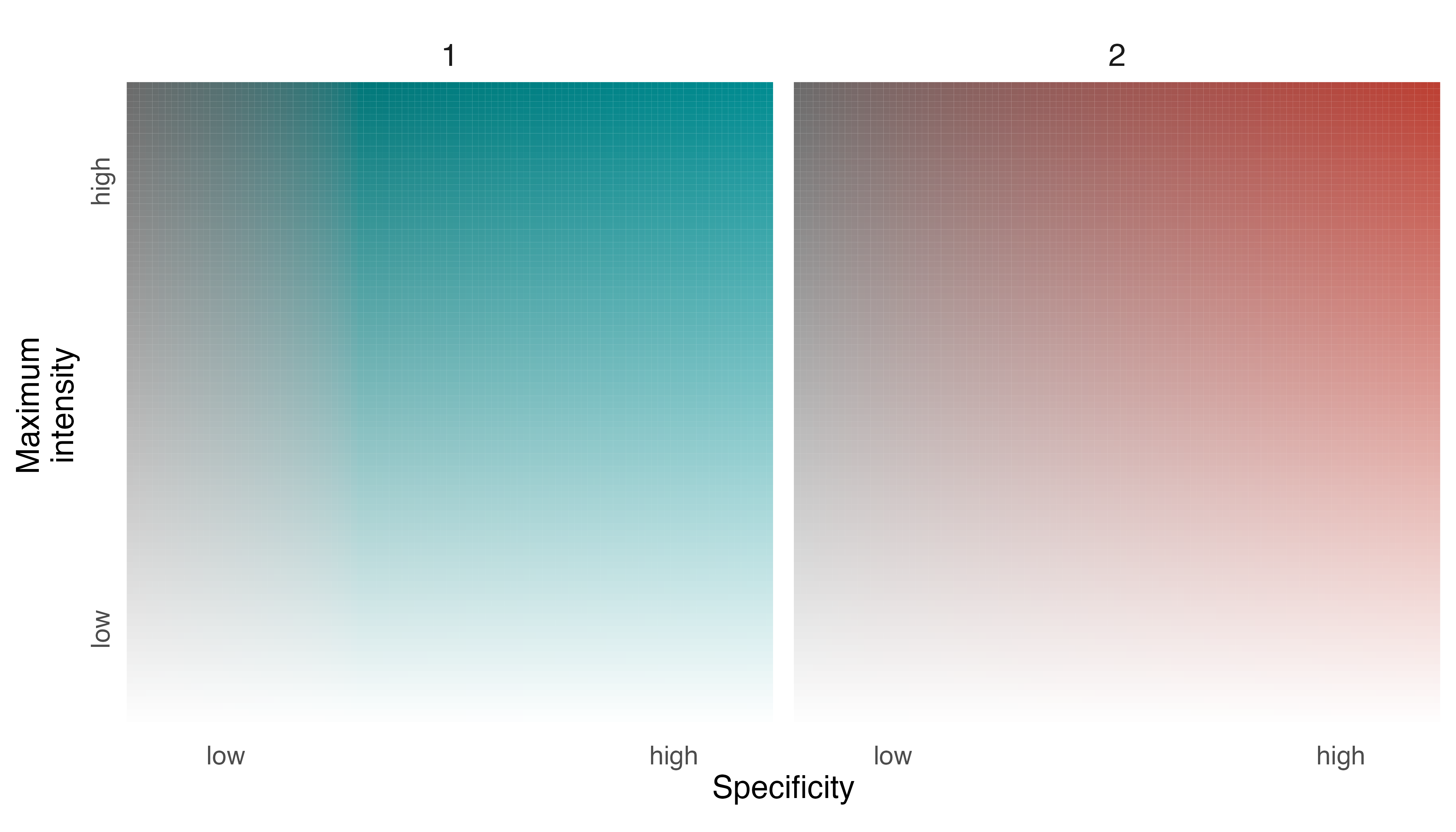
The legend is meant to tell us how the two individuals partitioned space in Etosha National Park over the course of a year, allowing viewers to understand locations that were used predominantly by one individual, or the other, and locations that were used equally by both individuals.
To help communicate this information more clearly, we should make
some adjustments to the legend. We can label the two facets with
individual identifiers using the group_labels argument in
legend_set() and we can
modifylabel_i,label_s, and axis_s
values to orient viewers.
# change labels of legend
l_elephants <- legend_set(p_elephants,
                          group_labels = names(elephant_ud),
                          # intensity label
                          label_i = "Intensity of use",
                          # specificity label
                          label_s = "Share of use",
                          # specificty axis
                          axis_s = c("equal", "sole"))

# show legend
print(l_elephants)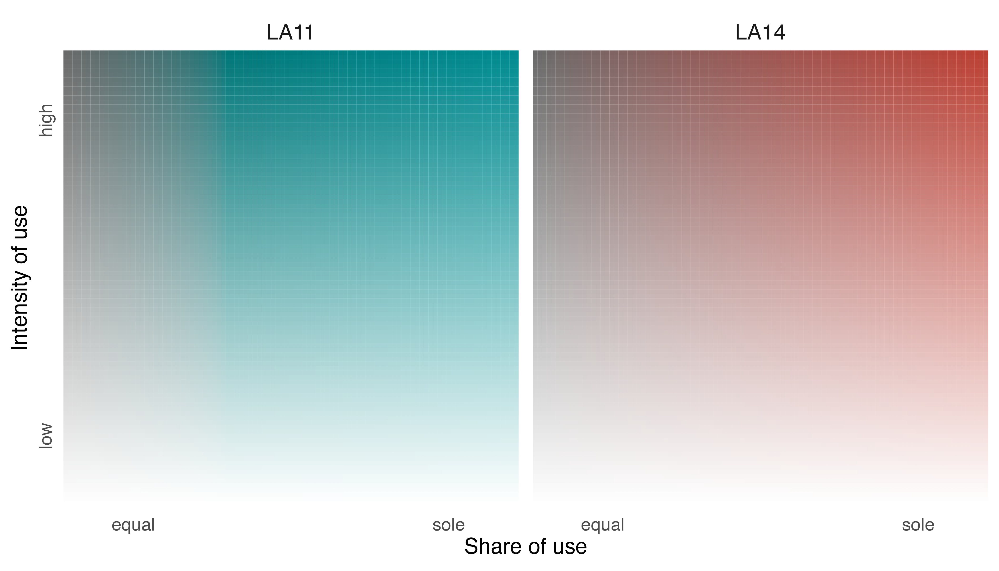
Now, we have a legend that further reveals the narrative of space use
by LA11 and LA14 in 2011 and we can position it within the map using
annotation_custom().
# position legend within map
map_elephants +
  annotation_custom(ggplotGrob(l_elephants),
                    xmin = -3000, xmax = 37000,
                    ymin = -2347500, ymax = -2305000)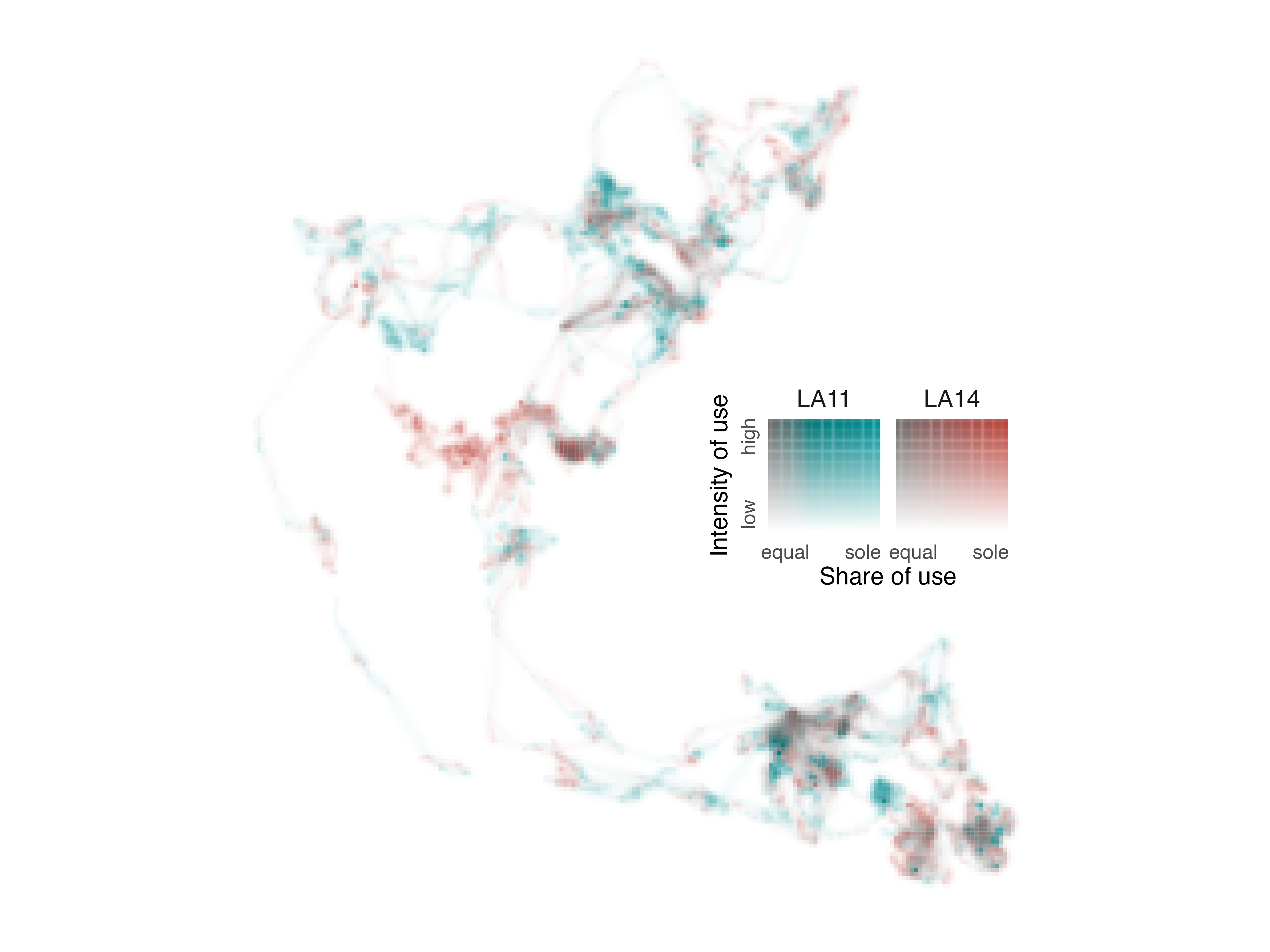
3. Displaying colorist maps in other software
colorist uses ggplot2 to construct
visualizations because it is an incredibly flexible visualization tool
that enables maps and legends to be amended and adjusted in many
different ways. However, some users may want to employ other tools for
visualizing colorist outputs, because of their greater
familiarity with those tools or because of specific features that are
not available in colorist or ggplot2.
Many of the R packages that enable plotting of spatial data (and most
external GIS software) rely on RGBa descriptions of color and opacity
instead of the hexadecimal-alpha descriptions used in
colorist functions. To accommodate display of
colorist maps in these other tools, the
map_single() function can be used to return a
RasterStack object containing layers of red, green, blue,
and alpha information. Users can then visualize those data in a variety
of other tools.
raster package
The raster package is a workhorse for handling and
analyzing gridded spatial data in R. Here, we return to our Field
Sparrow data, but instead of accepting the default colorist
map output, we specify return_type = "stack" in the
map_single() function. This change directs
map_single() to return an RGBa stack instead of a
ggplot2 plot object.
# ask for map as a raster stack
s_fiesp <- map_single(m_fiespa, p_fiespa, return_type = "stack")

# show stack information
s_fiesp
#> class      : RasterStack
#> dimensions : 100, 121, 12100, 5  (nrow, ncol, ncell, nlayers)
#> resolution : 26665.26, 26665.28  (x, y)
#> extent     : -1782551, 1443945, -1160698, 1505830  (xmin, xmax, ymin, ymax)
#> crs        : +proj=laea +lat_0=37.602 +lon_0=-86.264 +x_0=0 +y_0=0 +datum=WGS84 +units=m +no_defs
#> names      :   R,   G,   B, alpha, n_layers
#> min values :   0,   0,   0,     0,        0
#> max values : 200, 140, 216,   255,       12
With a RasterStack describing our map in RGBa values, we
can now opt to visualize the data using plot functions available in the
raster package. The standard raster::plot()
function illustrates each layer of the RasterStack in a standard color
palette. In addition to the R, G, B, and alpha layers, note the last
layer (i.e., n_layers) which describes, in every cell, the
number of layers in the original fiespa_occ data set
containing non-NA occurrence values.
# plot layers using raster plot function
plot(s_fiesp)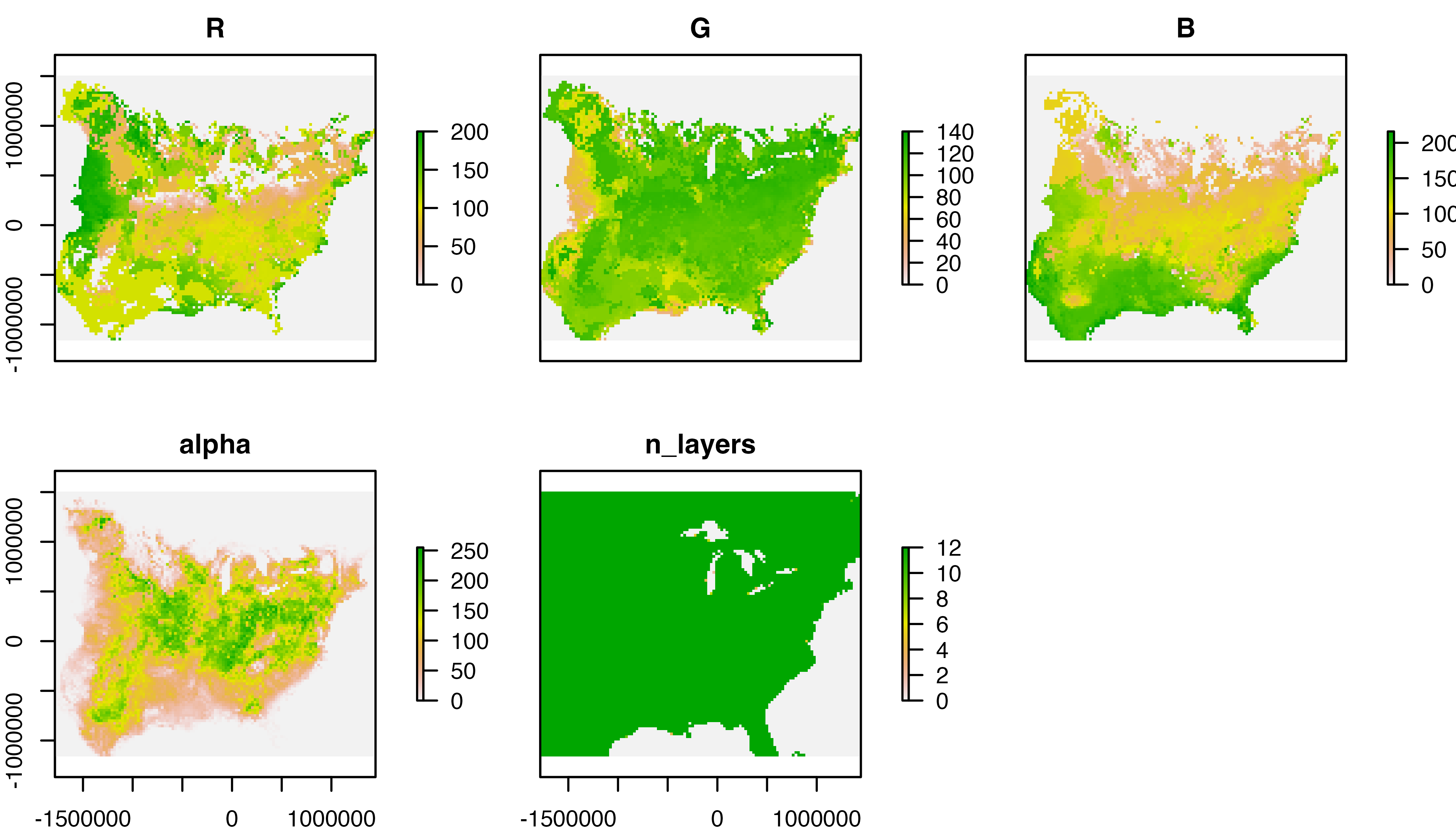
To reconstruct our colorist map with the appropriate
color scheme, we visualize the stack using
raster::plotRGB(), which requires specification of R, G,
and B layers. It also requires specification of alpha values as a
vector. If all has gone well, the resulting plot should look the same as
the ggplot2 plot generated within
colorist.
# plot r, g, b, and alpha layers to reconstruct colorist map
plotRGB(s_fiesp, 1, 2, 3, alpha = as.vector(s_fiesp[["alpha"]]))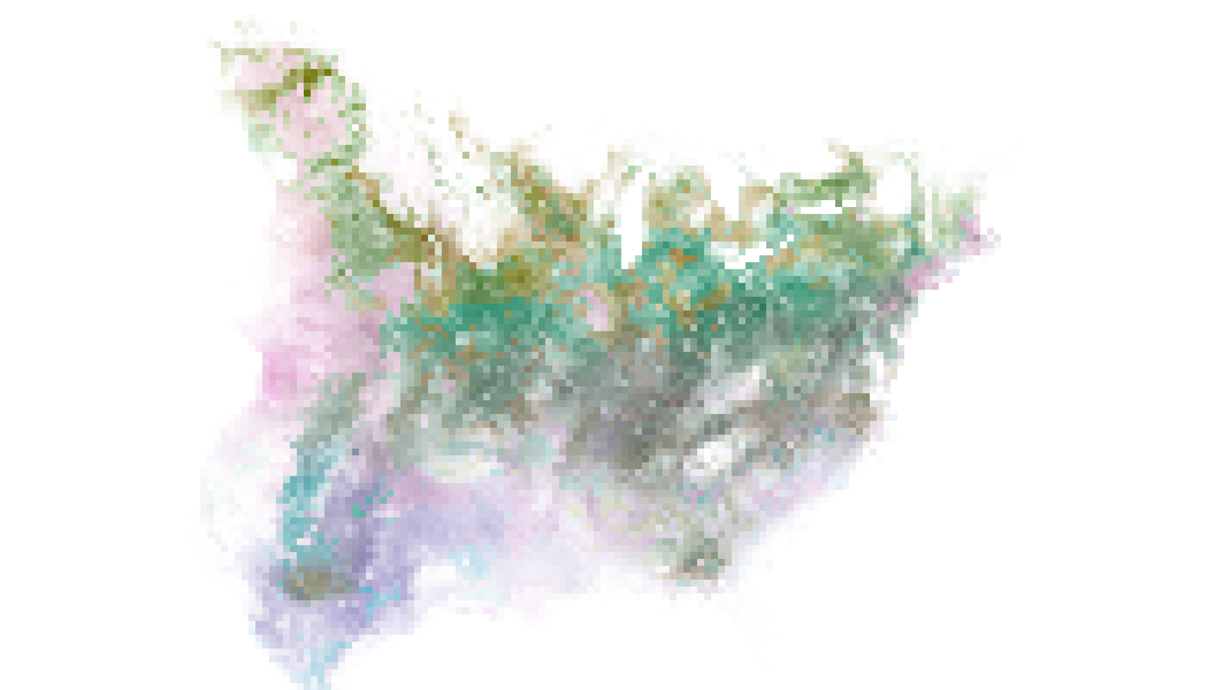
You can then add supplementary spatial data to your raster using
other plot functions within raster and related
packages.
QGIS
There are situations in which you may want to use external GIS
software instead of R to create a refined cartographic visualization of
colorist output. Here, we show how to recreate
colorist maps in QGIS, a powerful and free GIS.
Here, we reuse metrics and palette information that we have already
generated for two African Elephants to create a map. Instead of
accepting the default settings in the map_single()
function, however, we specify return_type = "stack" and
save the output as a RasterStack.
# ask for map as a RasterStack object
s_elephants <- map_single(m_elephants, p_elephants, lambda_i = -5,
                          return_type = "stack")

# save RasterStack to R working directory
writeRaster(s_elephants, "elephants_rgba.grd")
Then, we drag the resulting file into an empty QGIS workspace to begin the visualization process.
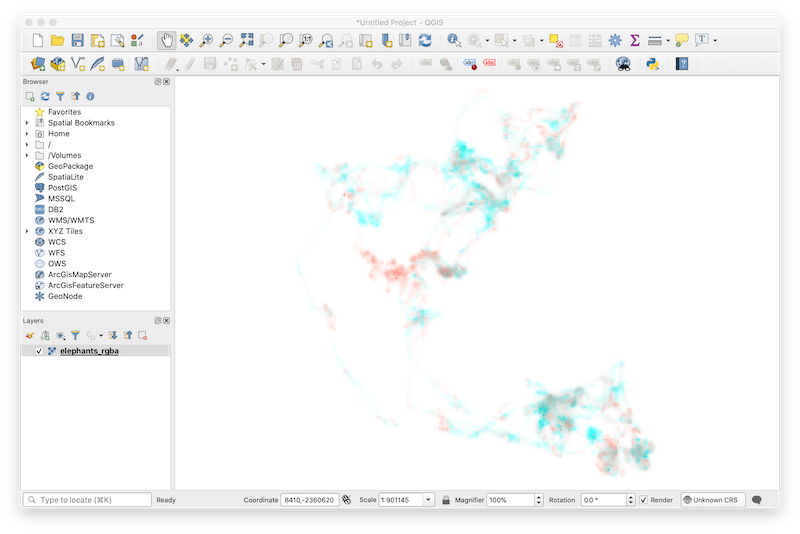
The default symbology assigned to the multiband raster by QGIS makes it appear as if our map were created using a box of pastels. To correct the appearance of the map colors, double-click on the elephant_rgba layer to open Layer Properties and ensure that data are being rendered in multiband color, RGB bands are in the correct order, and min and max values for all three bands are 0 and 255, respectively. In addition, be sure that band 4 (i.e., alpha) is specified as the transparency band in the Transparency tab of Layer Properties.
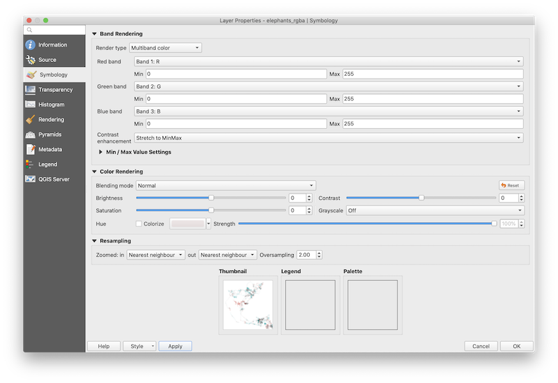
After clicking Apply, the thumbnail at the base of the layer
properties interface should correctly reproduce the map we were able to
generate in R. Click OK. Avoid making further changes to the symbology
of elephant_rgba, otherwise map colors will not match those generated in
the colorist palette and the map will become difficult to
interpret. Now, users can add and symbolize spatial data using
sophisticated cartographic tools available within QGIS.